The Lancia Thema 8.32 has never really been a “forgotten” part of the automotive landscape. Putting a Ferrari engine in a front-wheel drive saloon car is not the kind of thing a car enthusiast forgets.
But that’s with a good few decades of hindsight to dull the wow-factor of such a thing. Since the 8.32 emerged in 1986 we’ve had Ferrari engines – or Ferrari-adjacent engines – in other saloons like the Maserati Quattroporte and if you squint a bit, the Alfa Romeo Giulia Quadrifoglio too. As of this year you’ll find one in an SUV of sorts, the Purosangue.
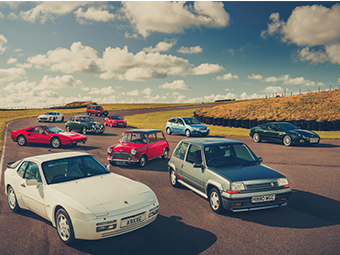
But this was a Lancia, a car you could also buy with a four-cylinder diesel in some markets for heaven’s sake. History does not record what drove Vittorio Ghidella, who ran the Fiat group at the time, to sanction Ferrari handing over a version of its 32-valve V8 engine for the creation of a plush saloon.
While we might think of the Thema as being a bit pedestrian, it’s probably important to note that the Lancia brand was still dripping with goodwill in the mid-1980s despite dropping a few clangers here and there, on account of its wild success in rallying. Three years earlier the 037 had won the manufacturers’ title, and a year after the 8.32 debuted, the brand would begin its record-setting winning streak with the Delta HF 4WD and Delta Integrale. Saloon car with a Ferrari engine? Unusual, but not outside of Lancia’s remit.
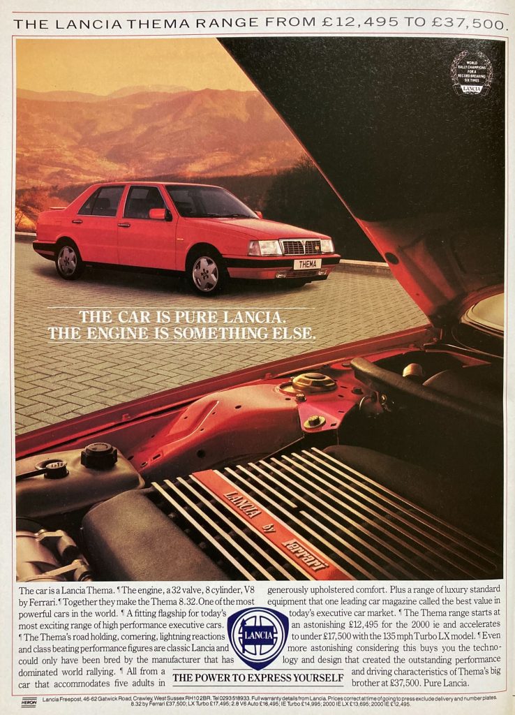
This late-1980s ad for the 8.32 makes sure to mention that rallying success, though the ad people would not have known that Lancia would go on to increase its six-title tally to ten by 1992.
The Ferrari engine is mentioned too of course, referenced prominently in the main image, and then given a few lines in the text, alongside humbler Themas. The entry-level 2000 ie gave the Thema range quite some bandwidth, the 8.32 being around three times the price of the £12,495 starting point.
“Pure Lancia”, reads the final sentence of the ad. That’s presumably despite the large prancing horse-shaped elephant in the engine bay, but as meetings of minds go, this was a compelling one.
There’s only one thing we’re confused about though: whose choice were all those visible paragraph breaks in the ad copy?
Check out the Hagerty Media homepage for daily news, features, interviews and buying guides, or better still, bookmark it. Or sign up for stories straight to your inbox, and subscribe to our newsletter.


If memory serves, the ad world had a bit of a thing about such things as para breaks being graphically depicted at that time. Blame the typographers.
Also, speaking as a copywriter, it may have been a sop to calm the writer who would have preferred a full page of copy with actual paragraph breaks and the concomitant ‘space and pace to breathe’ that that implies… rather than the squashed up typographic ‘design’ that we see here.
Sorry, once a copywriter, always a…