Editor’s note: Adrian Clarke is a professional car designer, having graduated in automotive design from Coventry University and achieving a Masters in Vehicle Design from the Royal College of Art in London. Tutored by the likes of J Mays, Clarke worked at a major European car maker before the pandemic knocked the world into a cocked hat. He now writes about design for Hagerty Media, and here he analyses the W113 SL Pagoda, in the year of its 60th anniversary.
Let’s try the car enthusiast’s version of a mindfulness exercise for a moment. Close your eyes, and take a moment to imagine the quintessential Mercedes Benz. I’ve got a crisp bank note, denomination of your choosing, that says the car you were picturing was constructed of mostly straight lines combining to construct a logically solid, yet elegant and restrained looking car; nothing like a current Benz. The man most associated with this Germanic aesthetic was Italian, the legendary Bruno Sacco, who headed the Sindelfingen studio from 1975 until 1999. But like a lot of great designers, he was the refiner not the instigator. It was his predecessor who first moved Mercedes away from pontoons and gullwings at the beginning of the sixties.
Paul Bracq, who would later make his name at BMW, studied under his countryman, French industrial designer Phillippe Charbonneaux. Like the American Raymond Loewy, Charbonneaux was true design polymath, both men leaving an indelible mid-century mark on their respective homelands. Bracq only worked for Charbonneaux for two years before having to complete his French national service. Recognising a young talent, when he returned in 1957 he was offered a job in the design office at Mercedes.
The Mercedes image towards the end of the fifties was one of rounded solidity. Above a range of indeterminate bulbous saloons sat the 300SL, recently can-opened into a roadster to prolong its shelf life, at the demand of Max Hoffman, Mercedes’ importer in America. Fearsomely expensive, it was essentially a race car for the road (that never raced). Underneath it sat the similar looking, but rolling on four cylinder saloon undercarriage 190SL. Mercedes was well aware the 190 was not a performer, so in time honoured tradition in 1957 engineers bolted an injected six into it and threw it swing axles et al, around the Nürburgring. It was nearly 25 seconds faster than the standard car, but technical difficulties and knowing such a model would be nearing the end of its life by the time it reached production put an end to the idea. The harsh reality was this pair of cars were too much and too little for the market. Now the time was approaching to replace them, and something to split the difference was needed.
Around this time Mercedes was developing a new range of saloons – the W111 ‘Fintail’ – that would introduce a revolutionary idea: a rigid passenger cell with deformable structures front and rear to absorb the energy from an accident – crumple zones. It didn’t make commercial sense to use such an expensive, radical new platform for just one range of cars, so in 1960, Professor Fritz Nallinger, Mercedes’ Technical Director, suggested using it for a new sports car to replace both the 190 and 300SL. The man behind crumple zones was engineer Béla Barényi, who over the course of his career registered over two thousand patents for automotive safety. And his ideas would later give the new sports car one of its most distinctive features.
Mercedes had withdrawn from all motorsport following the Le Mans tragedy of 1955, so the new car was not beholden to any racing activity. It was free to be its own thing. And what Mercedes wanted was a mature car that reflected the brand’s prestige and solidity, with a newfound importance placed on safety.
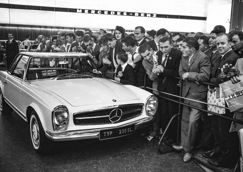
Introducing the car to the press at Chateau des Eaux Vives in Geneva 1963, Professor Nallinger said: “But now I may be permitted to explain the conception of our new 230 SL model: It was our aim to create with this model a very safe, fast sports car with high performance which, despite its sports characteristics, has a very high degree of traveling comfort.”
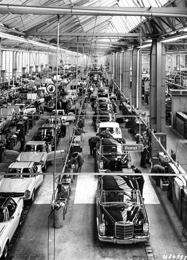
The W113 230SL sat on a shortened W111 chassis with the 2.3-litre, straight-six-cylinder engine taken from the saloon, but with mechanical multipoint injection to move the power up the rev range. A four-speed manual was standard, but with Mercedes keeping an eye on its main export market of the United States, the new SL was offered with both a four speed auto and power steering at extra cost.
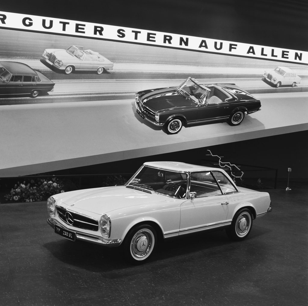
Pan-european road travel was still a possibility in those days. Depending on whether you were skiing or sunning the 230SL could be ordered as a convertible, a convertible with the hard top, or only the removable hard top (and no soft top underneath – confusing, I know). The distinctive concave shape of the hardtop, soon nicknamed ‘Pagoda’ due to it’s resemblance to oriental temples came about as a safety feature, again from the fertile mind of Barényi. He thought the highest point of the roof should be nearer the passengers heads rather than the middle, which gave the added benefit of larger side windows. Other safety features included split circuit front disc brakes, padded interior surfaces with no sharp corners, a collapsible steering column and, for the first time on a Mercedes, radial tyres.
Although ‘Unsafe at Any Speed’, the campaigning book by Ralph Nader, wouldn’t be published until 1965, automotive safety was something conscientious manufacturers were designing into their cars. The Rover P6, although not a competitor, emerged the same year as the Pagoda and had standard seat belts, an ergonomic interior with break-away plastic switches and headlights that refracted a portion of light back towards the driver, allowing them to guide the car accurately in the dark.
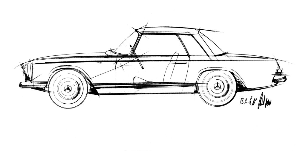
Dispensing with the upright, rounded stuffiness of the saloons, Bracq sketched a new sporting Mercedes that wasn’t beholden to the overt streamliner influences of the Gullwing. The Pagoda’s trick is looking substantial without appearing heavy. Mercedes’ reputation was built on quality of construction and thorough engineering. So although SL nominally stands for Super Lecht (Super Light), a gossamer, lightweight-looking car wouldn’t work for the brand image. It had to be something that exuded quality and usability.

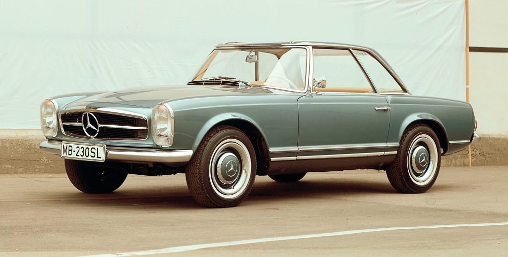
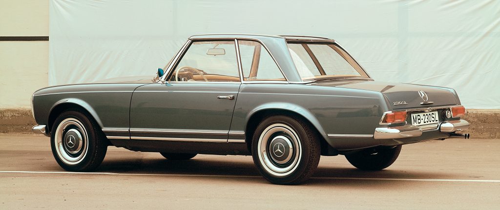
The Pagoda manages this by limiting the depth of the bodyside – or at least appearing to. It’s a visual trick accomplished by painting the sills black, so they disappear. It makes the whole car sit lighter on it’s generous wheels. Although the headlights are vertical they sit lower than the bonnet which has a slight bulge because it hides a tall engine from a saloon; this tempers the formality of the lighting’s upright graphic. It’s a supremely elegant confection of gently worked parallel lines that at first glance appear simple, but are extremely considered – there’s the merest hint of a hip just behind the door, and when viewed in profile there’s a subtle rake to the tail and a gentle taper towards the rear, giving an impression of movement and dynamism. When the hard top is in place it almost disappears thanks to the shallowness afforded by that concave shape and the generous glazing – a literal and metaphorical temple to lightness.
It’s a car for the discerning, those who valued quiet authority and getting there in comfort and style, as opposed to arriving first. The thrusting symbolism of an E-Type meant it found favour with villains and wide boys. The flashiness of a Corvette was for astronauts. Although both would have been a lot cheaper and given more performance, they were an altogether noisier, rowdier experience. The 911 which was still a few months off was going to be a much more expensive, exotic and treacherous proposition.
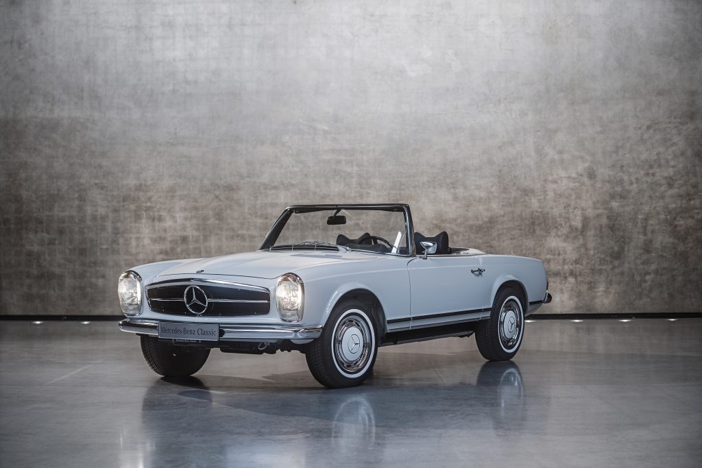
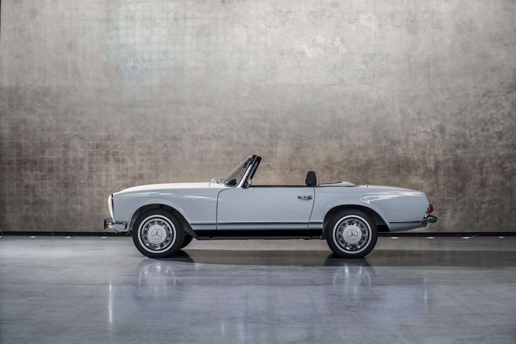
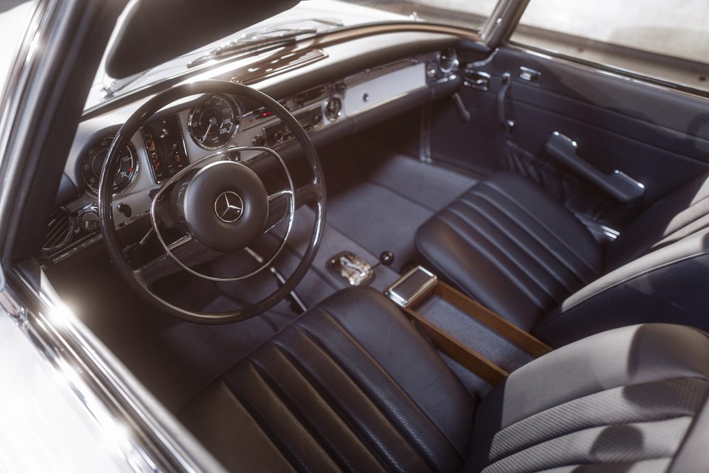
The beauty of the Pagoda is not just in its perfect lines and proportions. It was a practical, easy to drive, ergonomic and safe sporting car when such a thing was a novelty – it spoke to Mercedes’ depth of engineering and the thoughtfulness they put into its design when the norm was to take a powerful engine, clothe it as tightly as possible and make everything else secondary.
Bracq’s formula with the Pagoda was tweaked to be slightly more upright and formal for the next generation of saloons, starting with the W108 of 1965, which essentially set the Mercedes design language for the next thirty or so years, proving the inherent rightness of the original. When Bruno Sacco took over as head of design in 1975, he was acutely aware that because of a Mercedes’ longevity, there was a need for continuity of appearance between generations of models. He favoured careful evolution taking into account advances in safety and aerodynamics, and successfully transposed Bracq’s themes from the Pagoda to further SL models and saloons of all sizes until the W220 S Class of 1998, his final car.
The Pagoda’s appeal might be its timeless styling and its impeccable build quality, but its real legacy is that it was the genesis of what could be considered the journey to peak Mercedes. The quintessential Mercedes qualities were already in place, but the Pagoda gave them a form and identity that came to exemplify Gottlieb Daimler’s founding philosophy of “Nothing but the best”.
Get behind the wheel of the Mercedes 280 SL Pagoda, and read our drive story here.




In my opinion only, had the body been deeper and glass depth reduced retaining same overall height, it would have improved appearance and given it increased presence. The 3 pointed star is too big in my view, as it has been on subsequent models
Surprised that no mention was made of the car’s walk on part in the wonderful film ‘Two for the Road’. It looked almost as gorgeous as its lovely passenger (Audrey Hepburn).