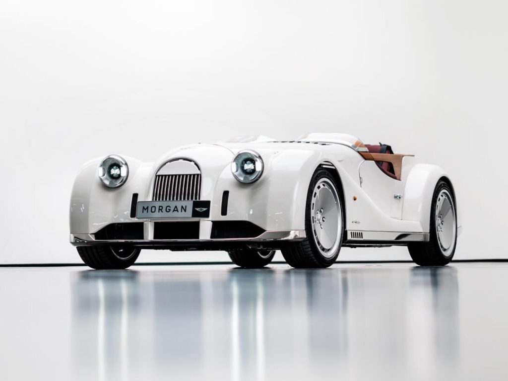
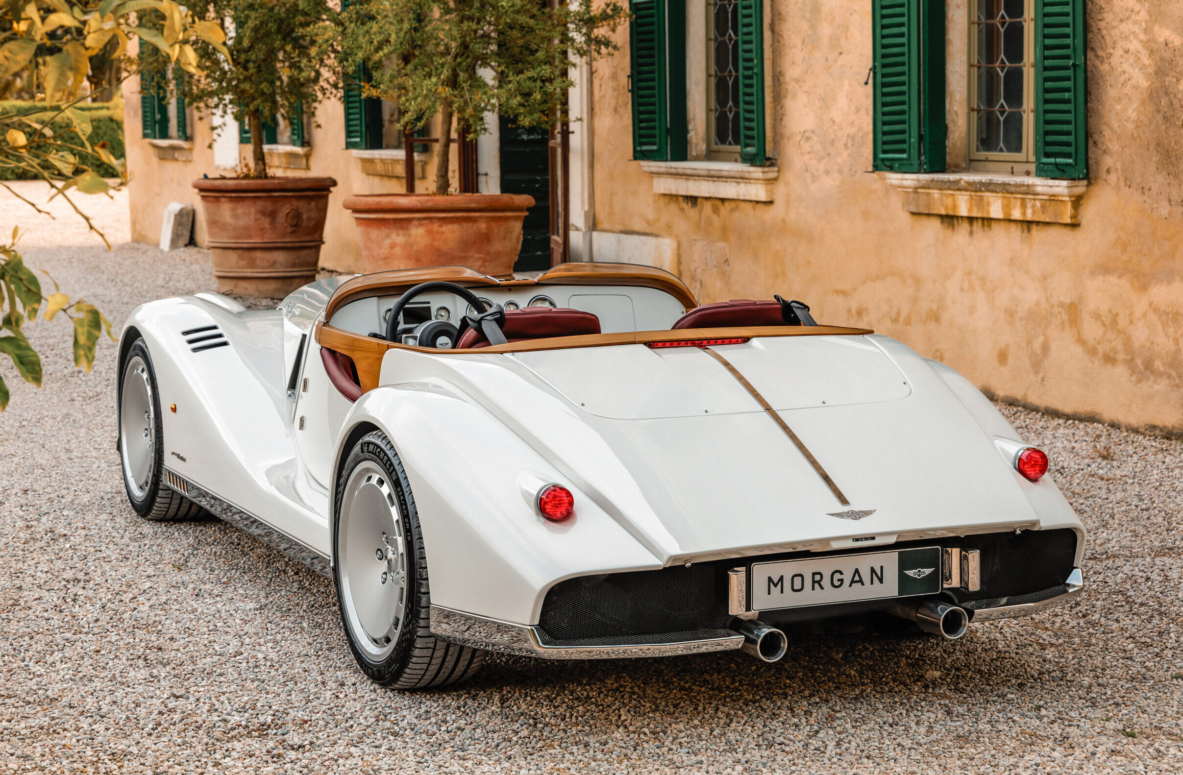
Out of all the world’s automobile brands, British boutique manufacturer Morgan might be the last anyone would associate with cutting-edge design. Fundamentally, the company’s cars have looked more or less the same for nearly a century. So I’m sure I wasn’t the only one caught off-guard when, last November, the firm announced it was partnering with the famed Italian design house Pininfarina for a future vehicle project. That partnership birthed the Morgan Midsummer barchetta (which Hagerty covered here).
As a former vehicle designer, I was intrigued by what could result from such an unlikely duo, so I must admit that I found the new Morgan Midsummer somewhat underwhelming at first glance.
However, it didn’t take long for me to realise that my mild disappointment had little to do with the car itself but rather stemmed from my unrealistic expectations about it.
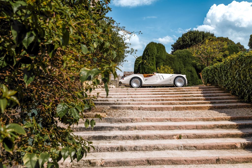
This is a relatively simple and pure sports car built by a niche manufacturer steeped in tradition. The Midsummer is the kind of “fun” project that would have had me jumping in excitement back in my car designer days: few requirements to satisfy, only a handful of people to please, and none of the bureaucracy that comes with a regular automaker’s various layers of management. Sign me up!
But make no mistake, designing for a manufacturer whose annual production tally would be a rounding error on Toyota’s balance sheet is fun, but it comes with its own unique set of challenges.
What you gain in creative freedom with a vehicle like this you lose in resources. Morgan makes between 800 and 850 cars per year, largely by hand. This puts clear and very stringent limits not only on what the company can do in terms of technology and facilities but also on how much it can spend to get there. And, with an annual turnover of around 35 million, Morgan likely spent less on the Midsummer project than General Motors does maintaining its Tech Center’s coffee machines.
Once I approached the Morgan Midsummer in this light, I finally started to appreciate the subtle brilliance in Pininfarina’s work here.
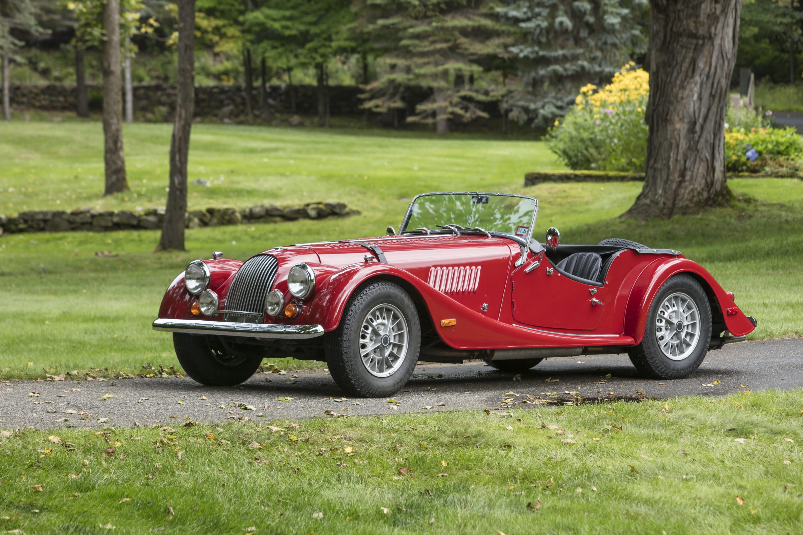
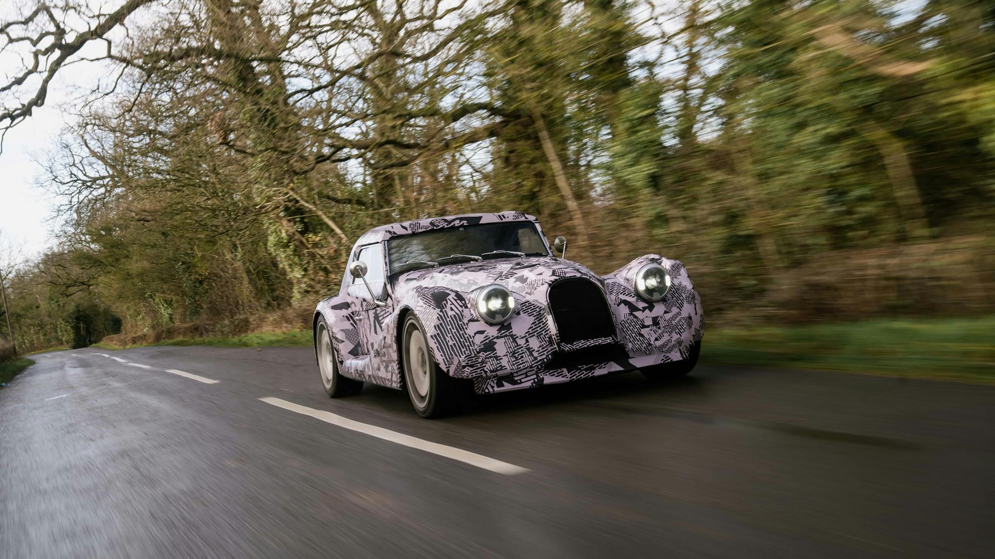
The first significant limitation that Pininfarina’s designers had to deal with is evident at first glance: The Midsummer isn’t a brand-new car, but rather a comprehensively remodelled Plus Six.
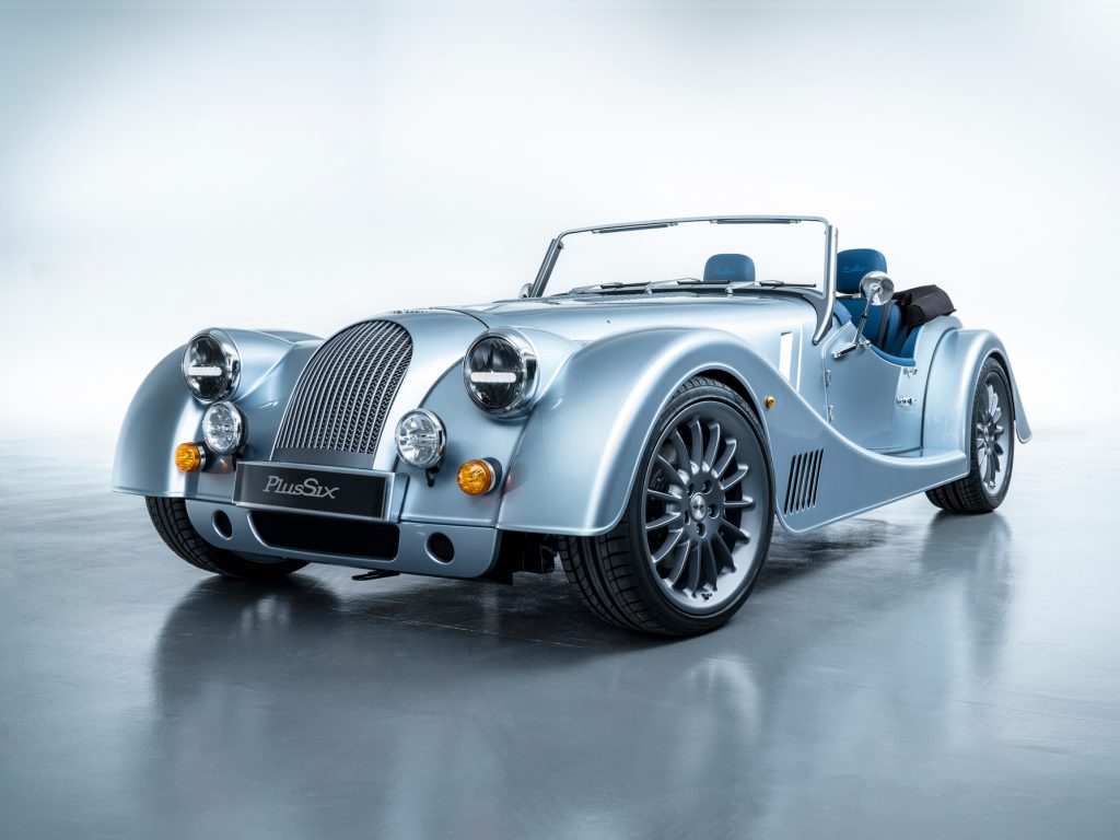
I must now confess that, although I’ve always liked a good ol’ classic Morgan roadster, the latest crop of models based on the “CX” platform has so far left me cold. Yes, the classic look is still there. But the proportions always seem to be ever so slightly off, and some detailing, particularly the front valance and the air outlets behind the front wheels, look downright jarring.
The Midsummer, though, is on a completely different level.
Cynically, one might consider it little more than a rehash of the Plus Six. But thanks to Pininfarina’s deft tweaks to the vehicle’s proportions, sculpture, and detailing, the Midsummer has gained the kind of grace and panache the rest of Morgan’s range could only dream of.
Let’s start with the proportions. The youngest stylists in Pininfarina’s studio may not remember who Harley Earl was, but they sure know how to apply his old mantra – “longer, lower, wider” – to the best possible effect.
First, designers eliminated the windscreen, creating an unbroken horizontal beltline that emphasises the car’s length and transforms its proportions compared to the Plus Six. Second, they lengthened the Midsummer’s rear overhang, balancing out the long front end and allowing the tail to taper much more gracefully than that of the Plus Six.
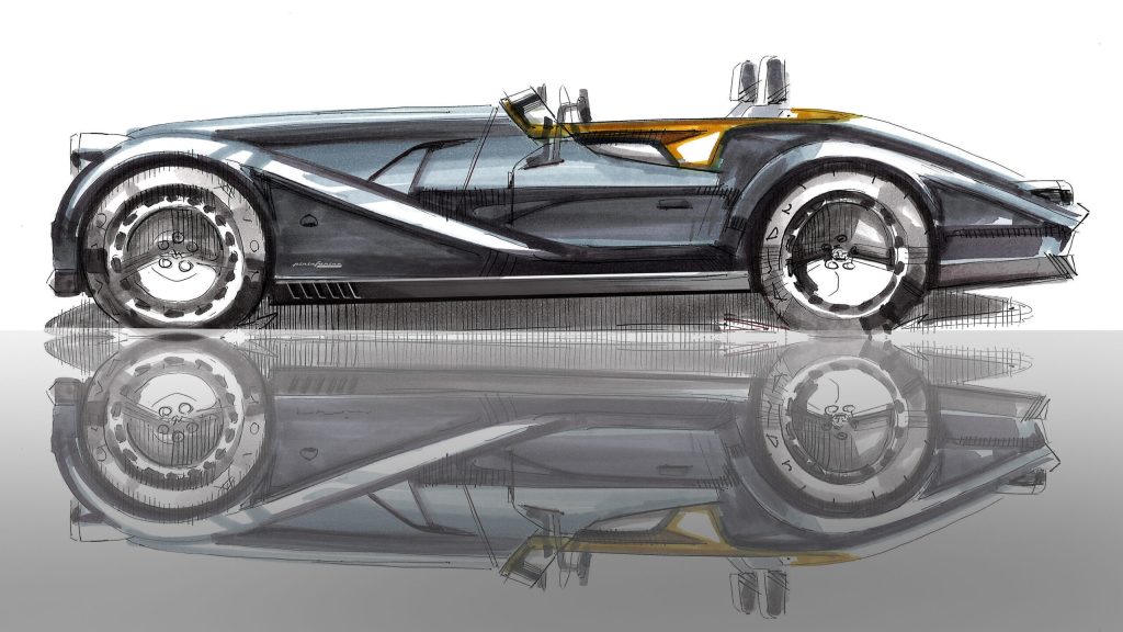
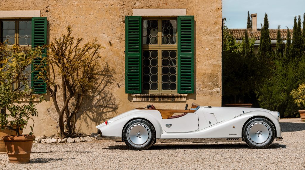
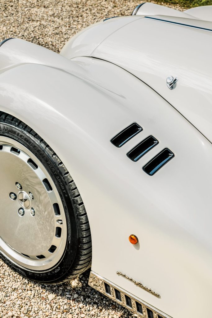
Once it fixed the vehicle’s proportions, Pininfarina gave the Midsummer a lovely new set of fenders. Compared to those of the Plus Six, the Midsummer’s fenders have a sharper, more contemporary surface treatment and extend deeper at the front to neatly integrate with the redesigned, full-width front valance.
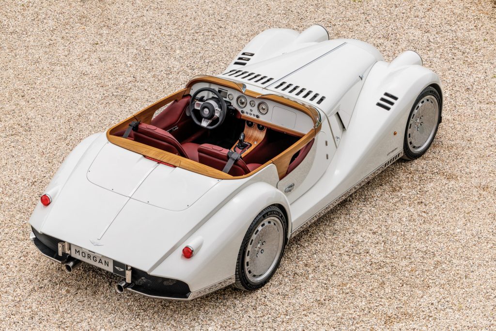
Then there’s the detailing, in which Pininfarina evidently took inspiration from yacht design. After all, most owners will likely use their Midsummer to drive to and from the posh marina of a suitably exclusive coastal town, so leaning on that aesthetic makes perfect sense.
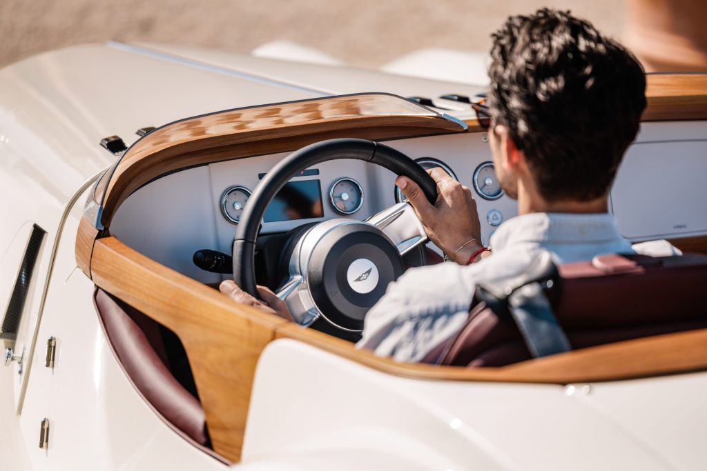
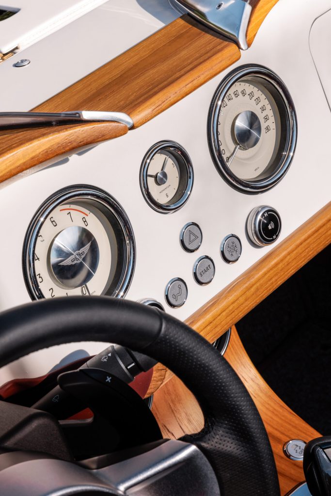
The chrome trim on the lower portion of the Midsummer’s body is clearly part of this “nautical” theme, but that’s not its sole purpose. In fact, giving the lower part of a car’s body a different finish is a classic designer’s trick. It visually elongates a car by slimming down the painted surface on the bodyside. At the same time, the exposed marine-grade wood that contours the cabin further underscores the design’s marine theme while paying homage to Morgan’s long tradition of using this material in its vehicles.
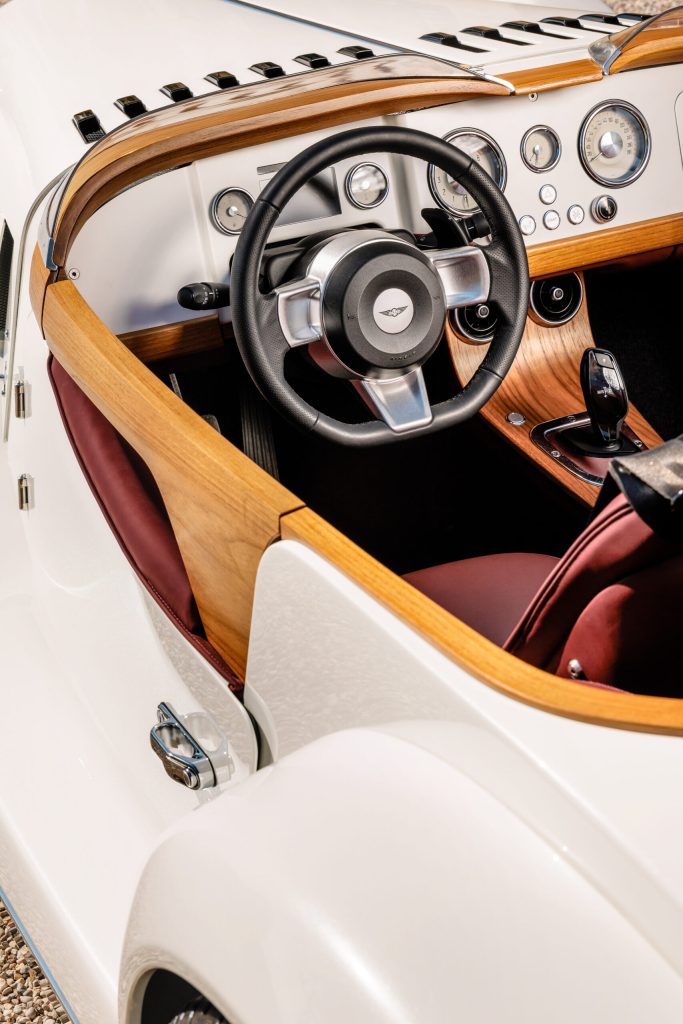
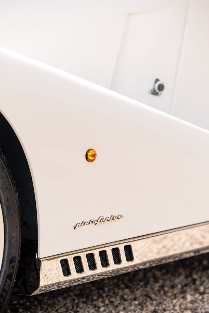
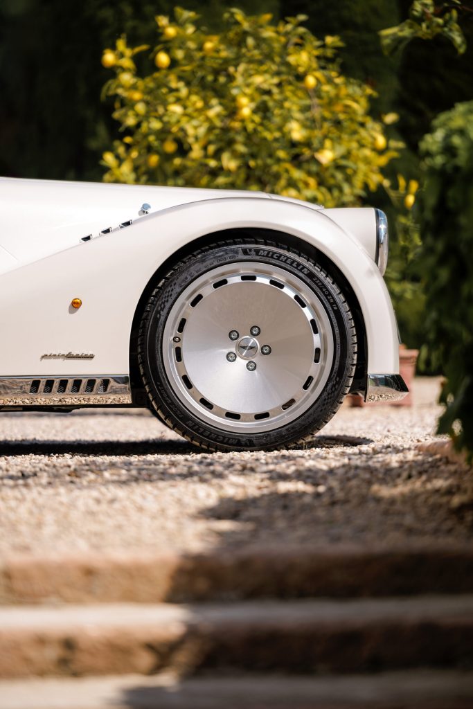
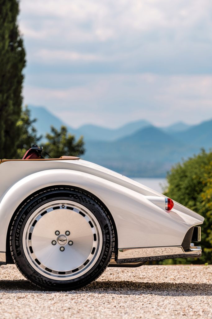
Last but definitely not least, the Morgan Midsummer has a killer stance. Its chunky wheels sit flush with the arches, and there’s so little space between the low-profile tyres and the wings that the rubber almost kisses the body – just as in a designer’s sketch.
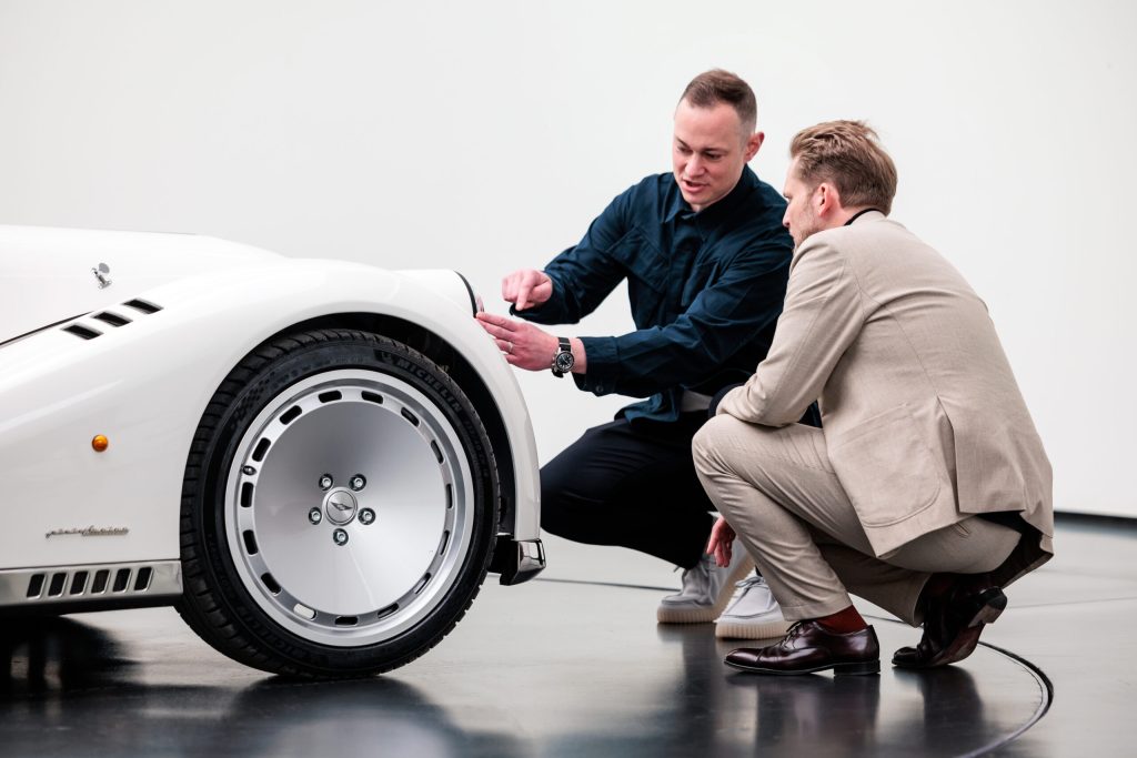
Moreover, I really dig the minimalist design of its 19-inch rims, which makes them look even larger and nicely complements the car’s overall design. After all, the Midsummer is far too elegant a conveyance to show off its brake rotors and calipers, and these rims’ visual weight contributes to making what ultimately is a tiny car look more substantial.
In conclusion, the Morgan Midsummer is the best-looking thing to come out of Malvern in a long time.
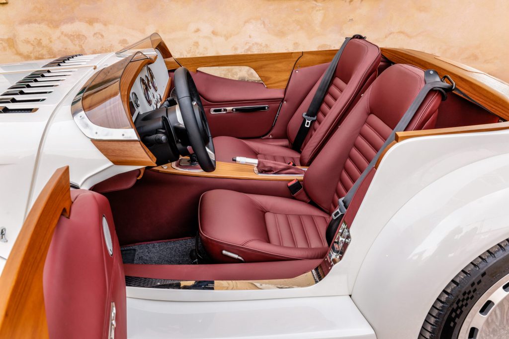
If there’s one thing I would have done differently, it’s the doors, which have been carried over unchanged from the Plus Six. I would have doubled down on the yachting theme and deleted them for a cleaner look. The average age of Morgan’s customers may not be the lowest in the business, but the Midsummer seems to sit low enough for most people to step over its sides without embarrassing themselves or pulling a muscle.
Nonetheless, the Midsummer is perhaps the first Morgan I’d like to own. That will never happen, of course, given that the planned run of 50 cars is reportedly sold out already, at around £200,000 a pop. But if I were in Morgan CEO Massimo Fumarola’s shoes, I’d waste no time letting Pininfarina work its magic on the rest of the marque’s catalogue.
***
Matteo Licata received his degree in Transportation Design from Turin’s IED (Istituto Europeo di Design) in 2006. He worked as an automobile designer for about a decade, including a stint in the then-Fiat Group’s Turin design studio, during which his proposal for the interior of the 2010–20 Alfa Romeo Giulietta was selected for production. He next joined Changan’s European design studio in Turin and then EDAG in Barcelona, Spain. Licata currently teaches automobile design history to the Transportation Design bachelor students of IAAD (Istituto di Arte Applicata e Design) in Turin.



Looking at it’s tail, I can’t help thinking of Marcos cars.