“For the Suprematist, the proper means is the one that provides the fullest expression of pure feeling and ignores the habitually accepted object.”
Kazimir Malevich
The perfection of bare geometry popularised by Russian avant-garde artist Kazimir Malevich has arguably created some of the most controversial paintings of all time. Take, for example, the one that looks like he painted a white square on a white canvas.

People often revile such minimalism, especially when it comes with a similarly radical price tag: I’ve lost count of how many people think they can replicate suprematism with a can of white paint, display it in a gallery, and get chumps to buy it for insane prices. Except these haters (as it were) never woulda considered doing it in the first place had it not been for artists like Malevich. And I reckon they weren’t already immersed in abstractionist theory, ensuring art remains unbounded and unrestricted by human constructs.
Automotive design is significantly different, as it can only take a pure form so far before things like safety regulations, functional requirements, and manufacturing constraints come into play. The suprematist design of the Tesla Cybertruck threaded that needle shockingly well, much to the beholder’s delight/dismay. So let’s run it over the vellum and see what conclusions come to the surface.
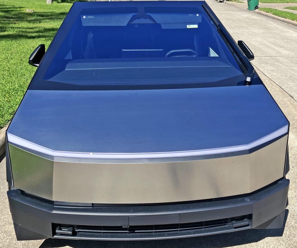
Tesla’s design team and their controversial CEO likely didn’t have Russian suprematism on their minds when fashioning the low-resolution Cybertruck. The front end has a unique stainless-steel face and light signature that resembles the mask of a superhero, with a strong neck (bumper) below and a monolithic mane of glass shooting back from an impossibly flat bonnet.
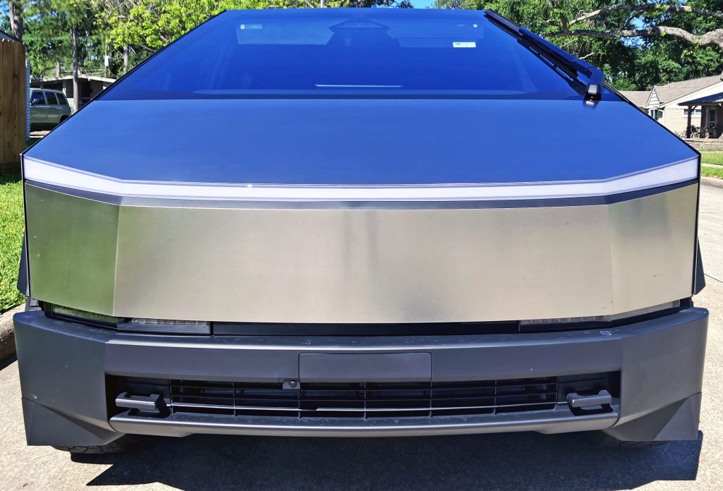
Headlights lie between the “mask” and the neck below, and searching for them is almost unnecessary. It takes away from the sheer joy of the hard lines of the wings and windscreen, which share a vanishing point that is easier to explain than on any other automobile in production.
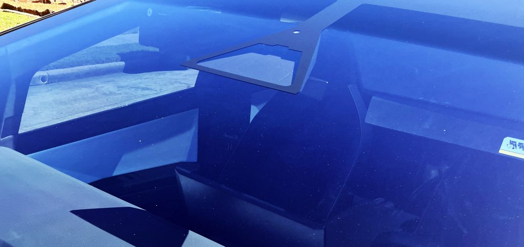
I am terrible with sci-fi references, but this cloistered space for sensors and cameras reminds me of some spaceship’s appendage from a Star Wars movie.
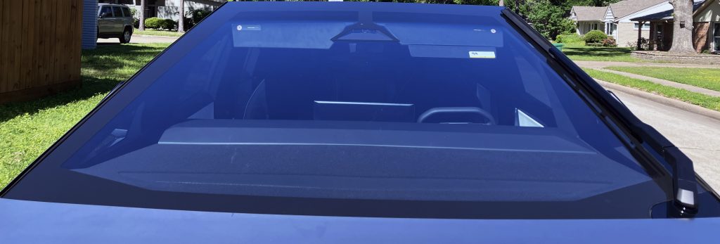
The perfectly flat, trapezoidal shape of the Cybertruck’s windscreen is part of the vehicle’s radical signature, as it blends seamlessly with the bonnet. It’s reminiscent of design studies from Italian studios in the 1970s, or Trevor Fiore’s Citroën Karin from 1980.
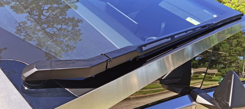
Part of the windscreen’s appeal comes from the lack of a cowl to house the wiper blades and fresh air ducting for the HVAC system. Here, the only functional element of the cowl is the oddly shaped footprint for the base of the Cybertruck’s massive wiper arm mounted at the lower right. Singular, because the other side is just unadulterated glass.
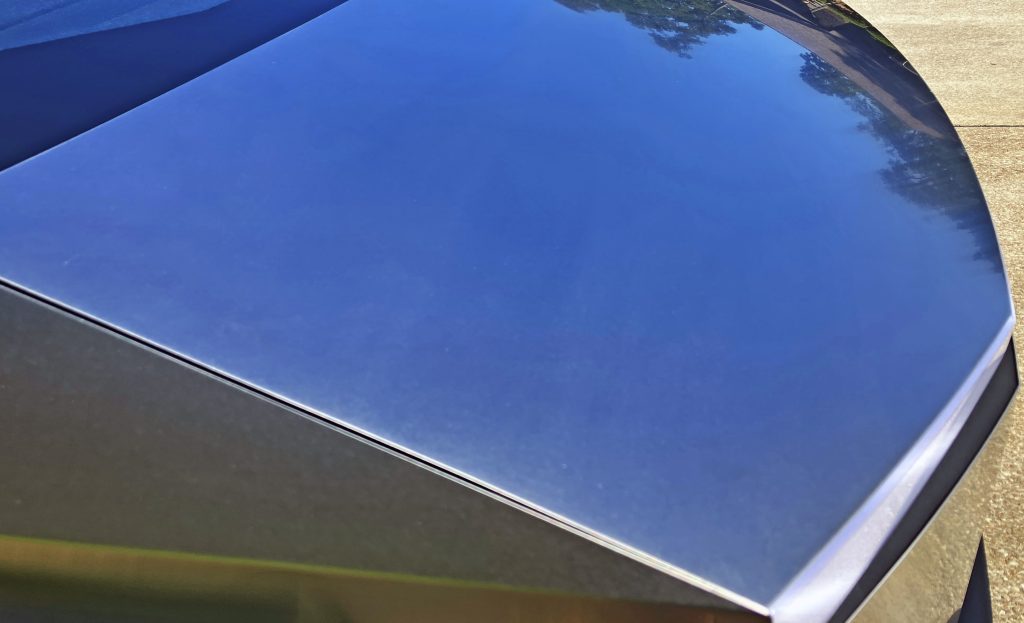
Just below the seemingly non-existent cowl is one of the most understated, distraction-free bonnets ever to grace a pickup truck.
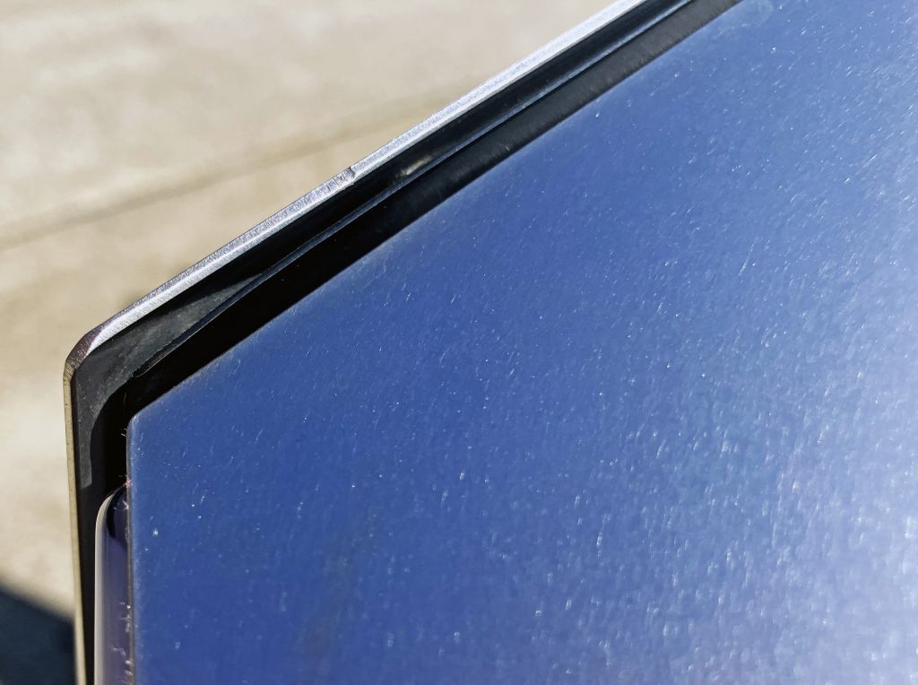
The only issue is how the stainless steel wings and bonnet butt up against each other. Looking more like unfinished construction than a mass-produced machine is almost part of the equation, however: A case can be made that these are akin to blade wings on older luxury vehicles. That case may be poppycock, but it’s convincing in person.
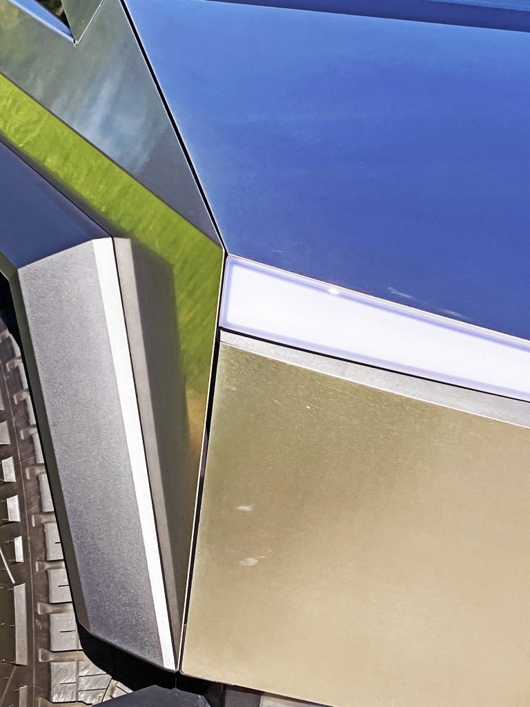
Appalling panel gaps aside, the superhero mask makes more sense from this angle. The front fascia, wings, bonnet, and lighting strip all look like items you’d see on a “normal” vehicle, but they’ve been reduced to their most basic forms, like a full-face helmet on a motorcyclist.
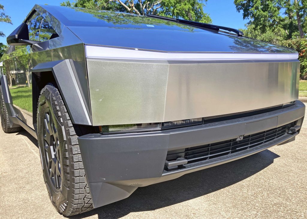
But when you step back and admire (as it were) the whole design, you see how Malevich’s suprematism is contorted into cyberpunk transport for elitists escaping a dystopian future: There’s a cab-forward cabin, angry angles and slashes, a squinty light bar under a furrowed brow, and headlights that are forced out of the equation.
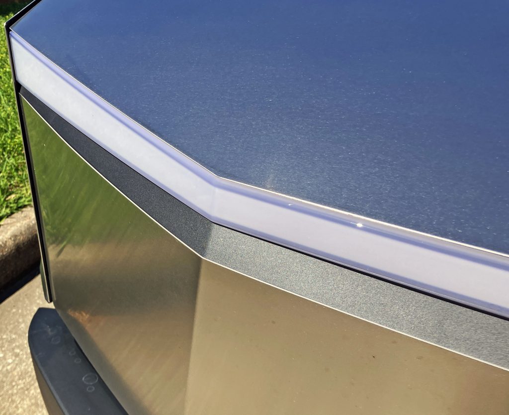
That squinty light bar took a fair bit of surfacing to come to fruition. While the bonnet is close to flat, its outer contour makes the lights’ general shape. Below is the front fascia in stainless steel and a black plastic(?) textured filler panel. That filler panel allows the radically angled light bar to make sense with the far flatter stainless steel face (with only two bends on its profile). Panel fitment between the light, filler panel, and fascia is surprisingly good.
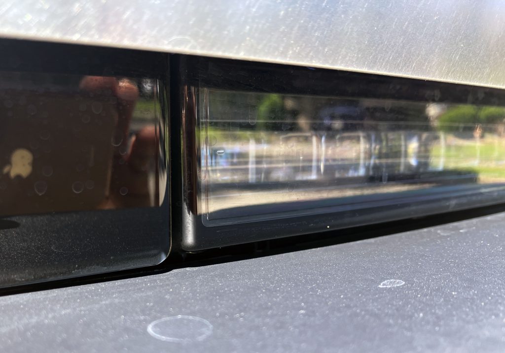
The Cybertruck takes to the next level the modern designer’s mantra of hiding headlights in places normally reserved for understated fog lights. This is pure architectural excellence, worthy of an office building or a high-end living space.

Below the front licence plate bracket lies a rather ordinary, almost HVAC contractor–grade grille. Which is a nice throwback in an era of overdone grilles on modern vehicles, and there’s even a shutter mechanism to seal off the system and reduce aerodynamic drag.
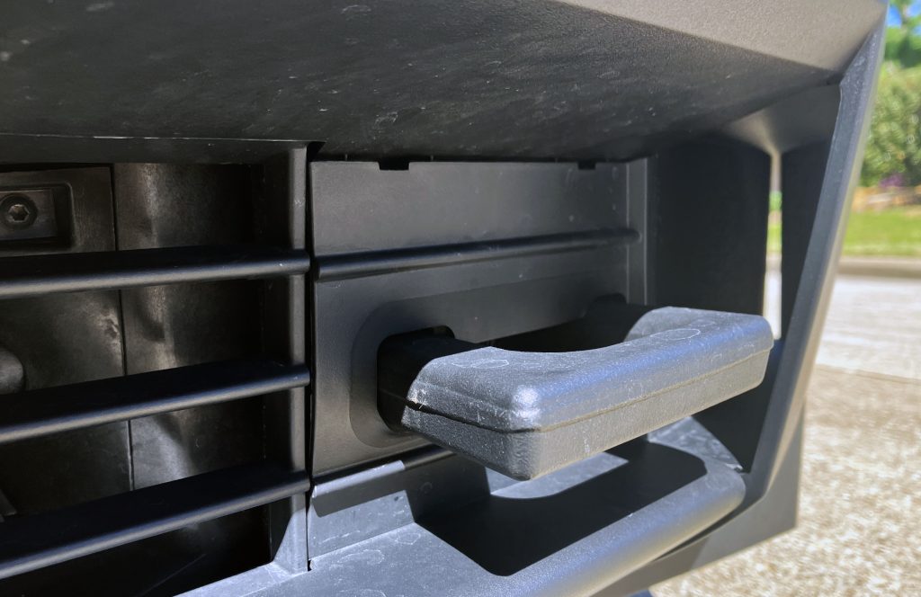
The civil engineering references continue elsewhere on the bumper, as the plastic trimmed tow hook and its garage door–like background remind me of a loading dock in some Robocop-ian action scene. To the right of the hook is a front valance with clever angles that make the light dance on its body.
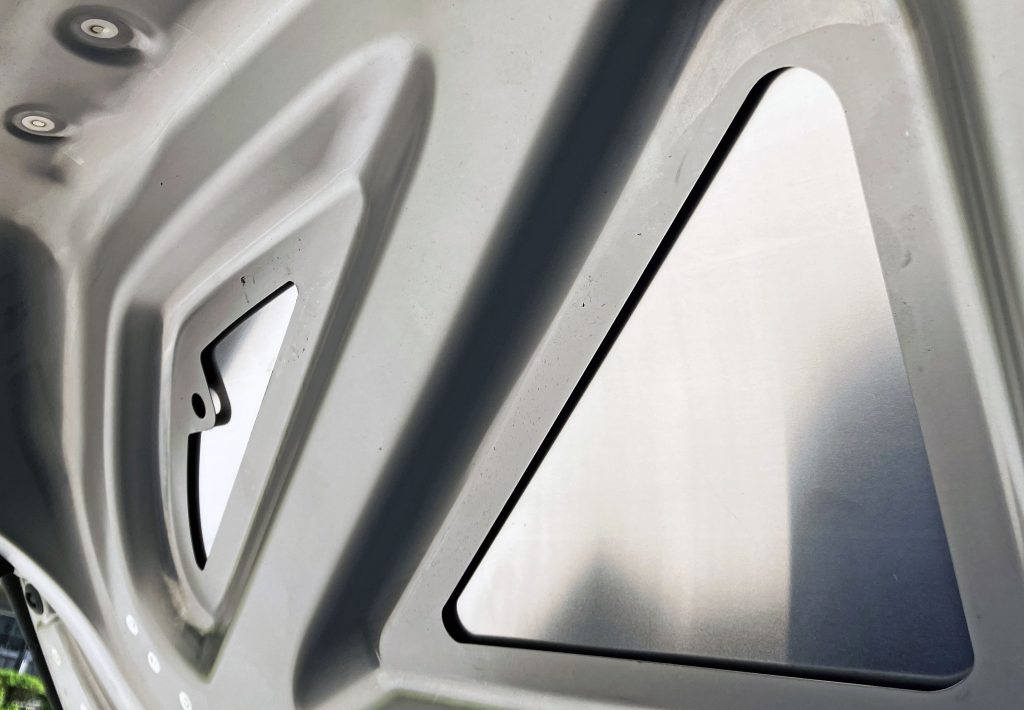
The Cybertruck’s frunk is nothing to sneeze at, but the hexagonal washer fluid reservoir cap and the contrast of the stainless steel bonnet against its aluminium substructure are fascinating in their presentation of geometric supremacy.
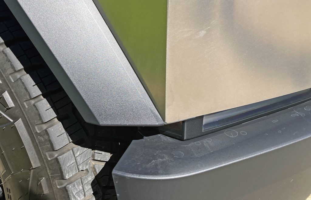
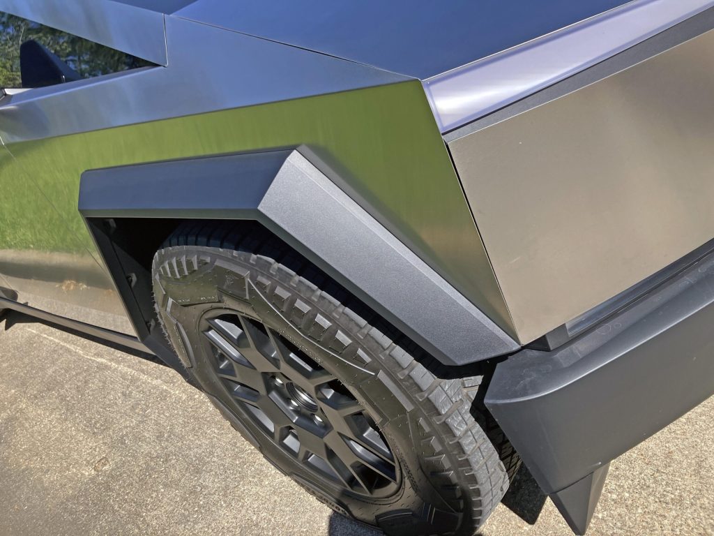
The transition to the side view is challenging. The vertical wing looks uncomfortably static against the downward slope of the wheel arch, but it makes more sense when stepping back and seeing the A-pillar blend with that arch.
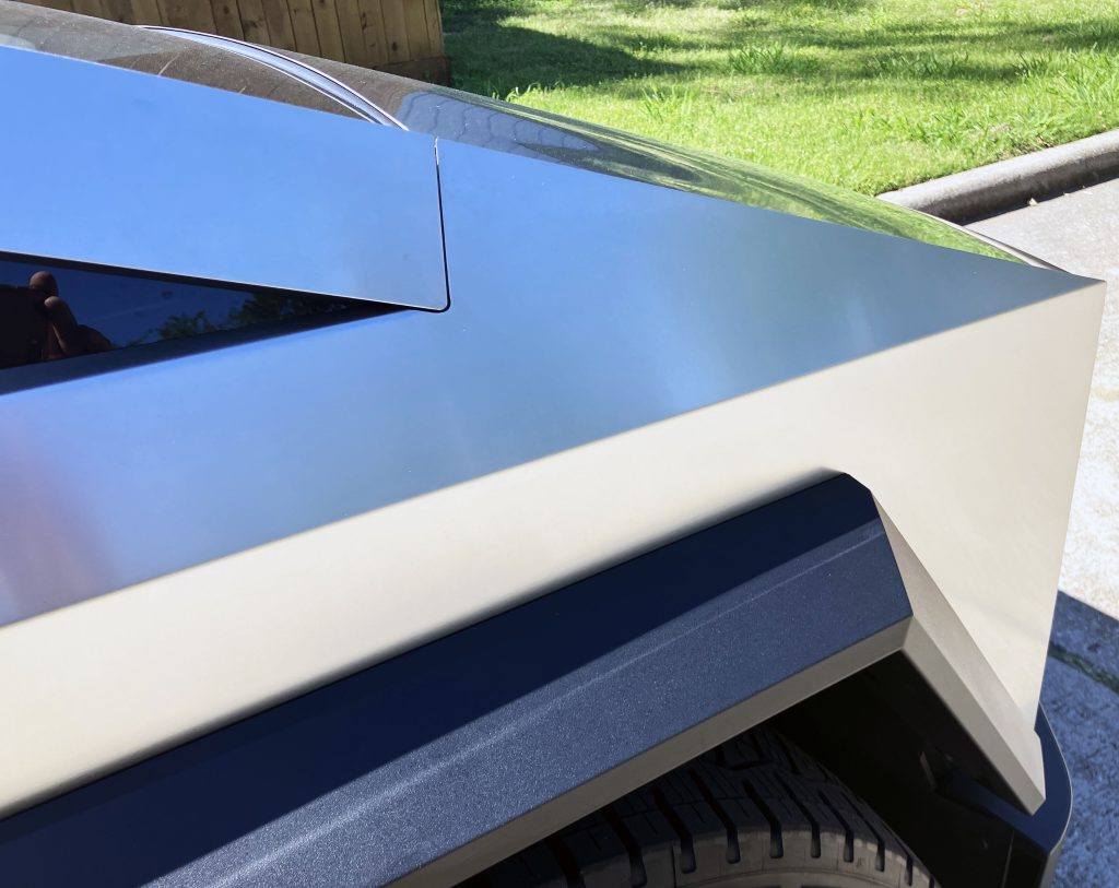
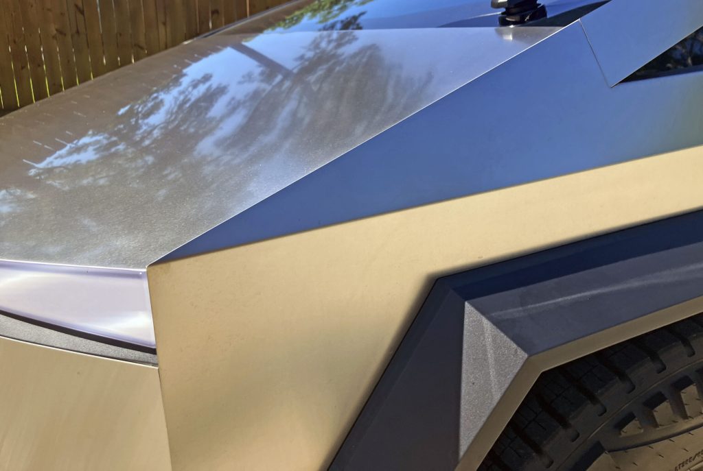
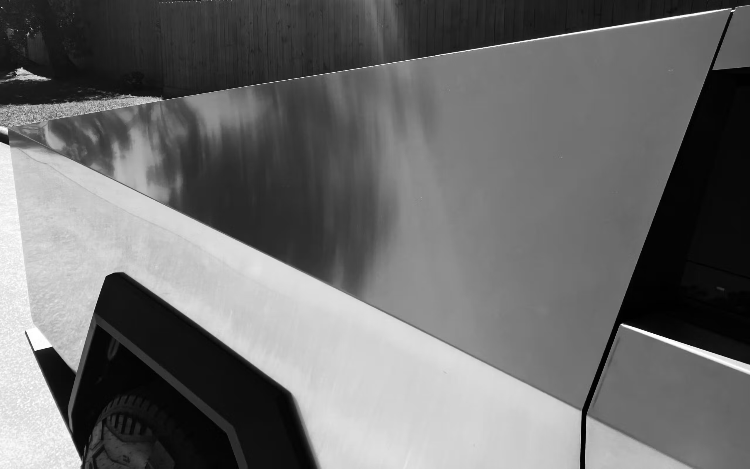
And what an A-pillar this truly is. It’s intentions are fully realised by the bonnet and front wing, much like on a Ford Aerostar. Except Ford’s minivan wasn’t clad in stainless steel, with this material’s minimal surfacing requirements. The harsh angles and semi-reflective finish make the sunlight and shadow absolutely dance on the Cybertruck’s profile.
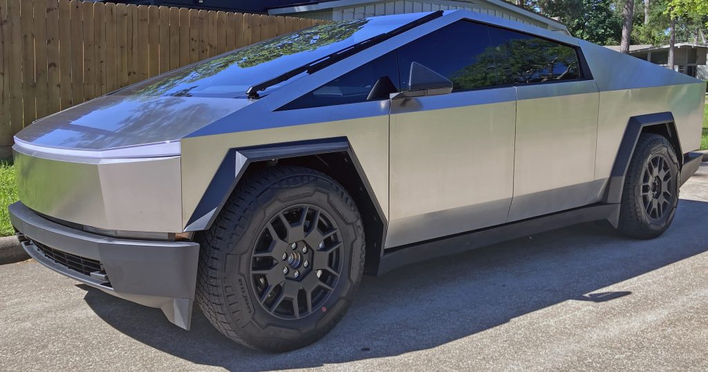
But the rest of the body doesn’t necessarily appreciate or believe in the A-pillar’s sleek overtones. There is conflict at every point below the A-pillar, and that challenge continues down the body side. In fact, this is a vehicle that challenges you from almost every angle, and that isn’t necessarily a good thing.
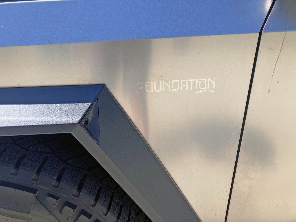
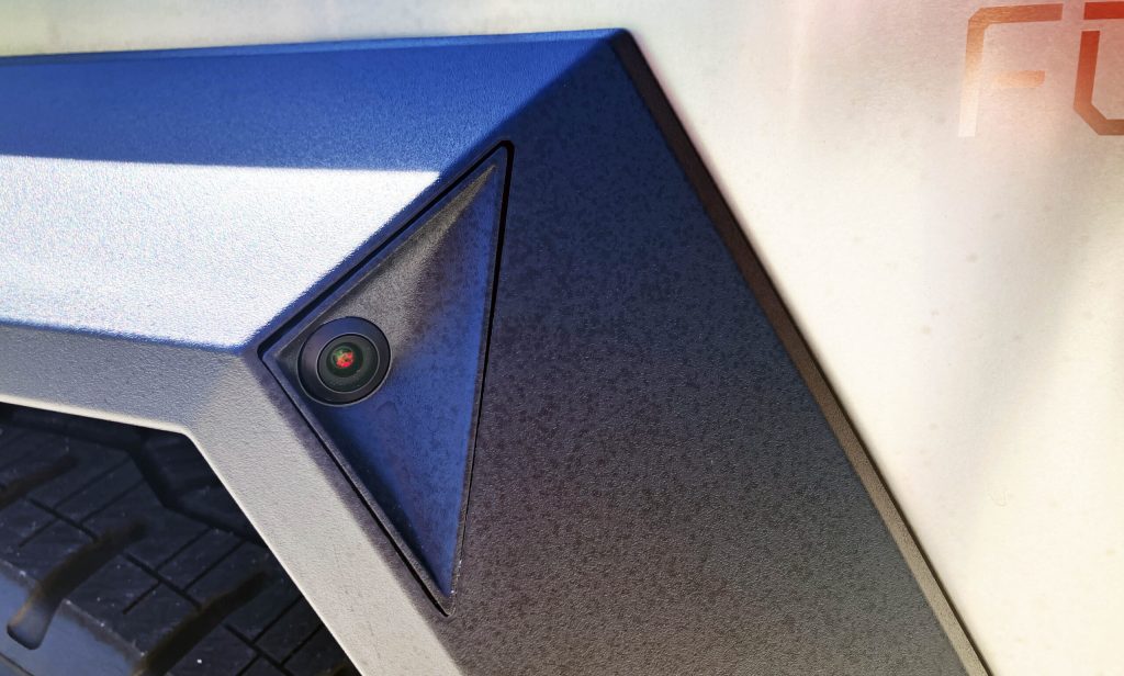
But geometric surprise and delight lie in the details, especially how the angular wing arches complement the harsh bends present in the Cybertruck’s stainless-steel cladding. And the triangular carve-out for the camera is abstractionism worthy of an art gallery.
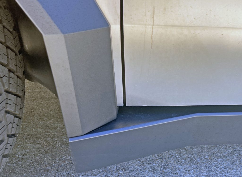
The wheel arch bends in harmony with the crease in the stainless steel, but it makes no such effort to do the same with the charcoal-coloured rocker cover below it. The intersection feels like a primitive cave, or the lair of a Batman-like hero.
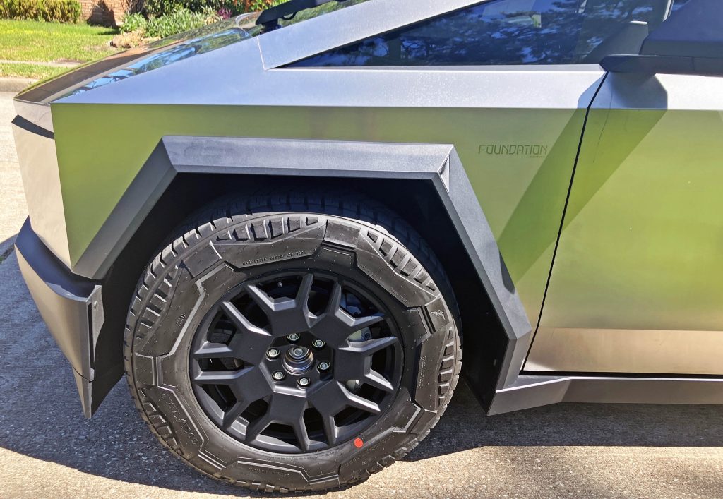
A big problem with this design stems from the wheel arches and the bespoke Goodyear tyres each being designed with geometric flair in mind, but the structural wheel doesn’t want to abide. Tesla made an angular wheel cover that fit into the recesses of the tyre’s sidewall, but it quickly proved to dig into the rubber in real-world driving. We are left with this unfinished wheel design instead.
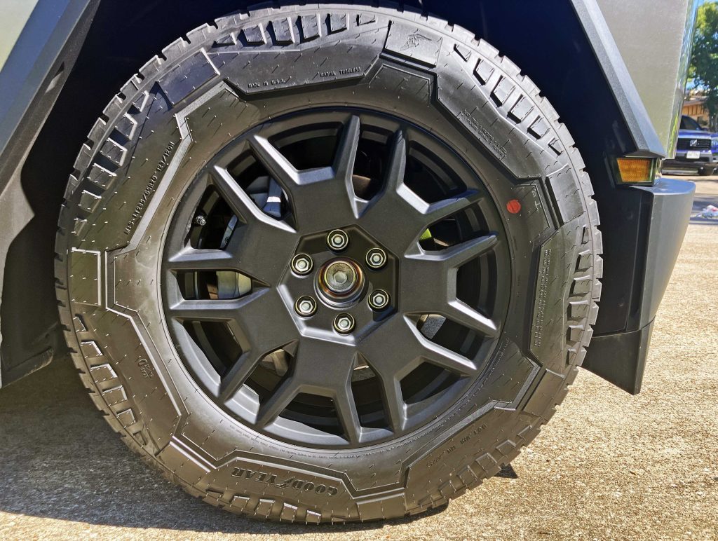
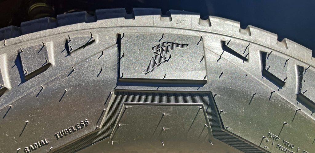
Goodyear likely worked hard to make a sidewall worthy of a Tesla wheelcover, to the point of adding its Wingfoot logo where the cover ended at the sidewall. There are talks of a new wheel cover in the works, with spokes that won’t not extend into the sidewall. And with those covers comes a far more conventional tyre, allegedly.
If true, that has the potential to make this Goodyear the rarest of rare tyre designs on the planet.

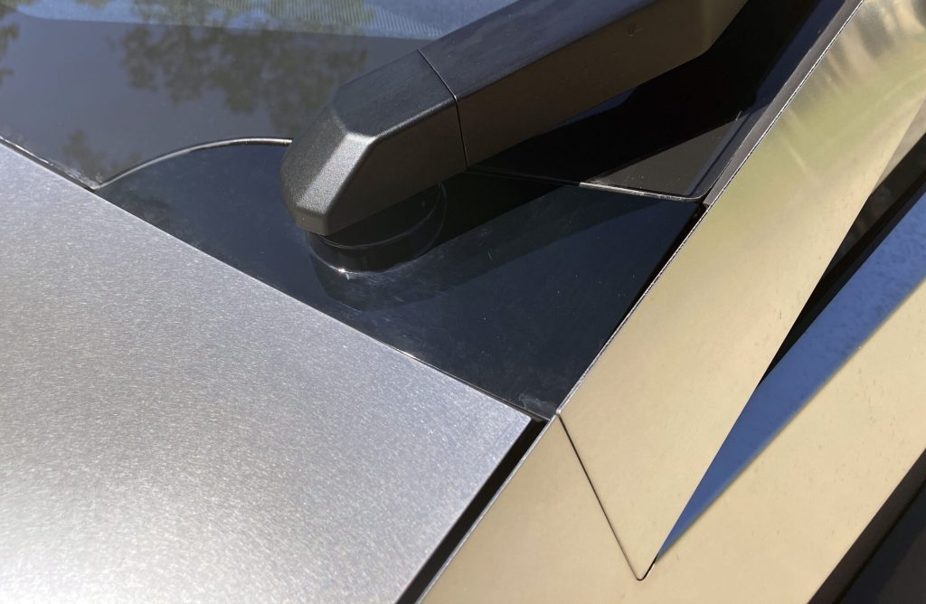
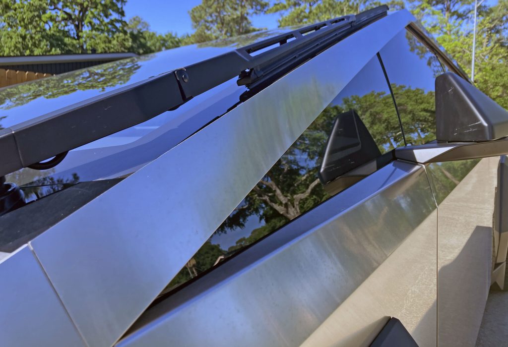
Above the wheel arch is where the Cybertruck’s remarkable look has more merit: The body-side crease turns into a sharp, angry triangle thanks to the A-pillar and a daylight opening (DLO) that extends far ahead of the front door.
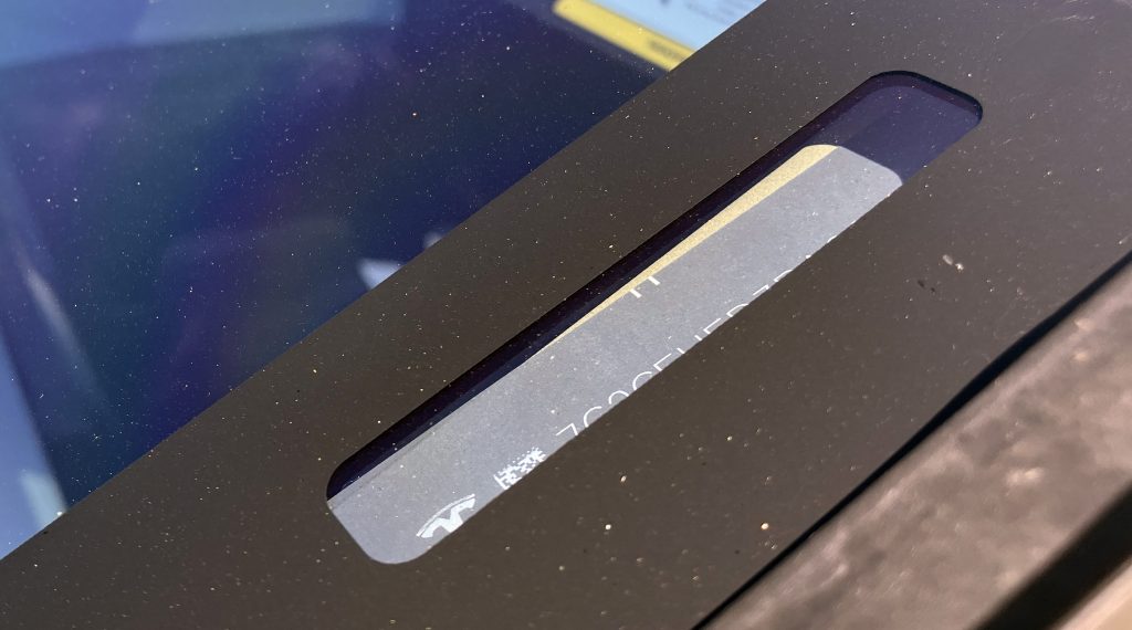
You don’t necessarily remember that the Cybertruck’s minimalist cowl area lacks a VIN plate. So it’s instead placed on the A-pillar, behind the windscreen.
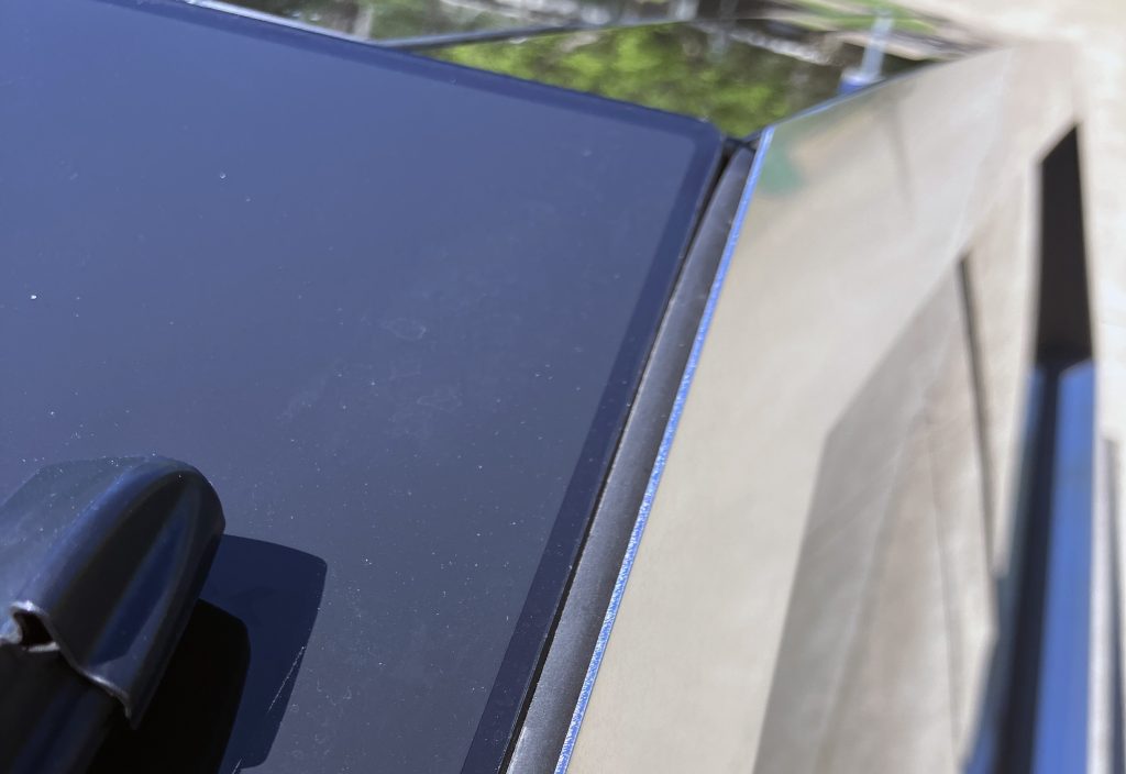

The intersection of tinted glass and brilliant stainless steel feels right, but the weatherstripping’s fade-away action at the top of the A-pillar is a bit disconcerting. (The vehicle was dead slient at speed during my time with it.)
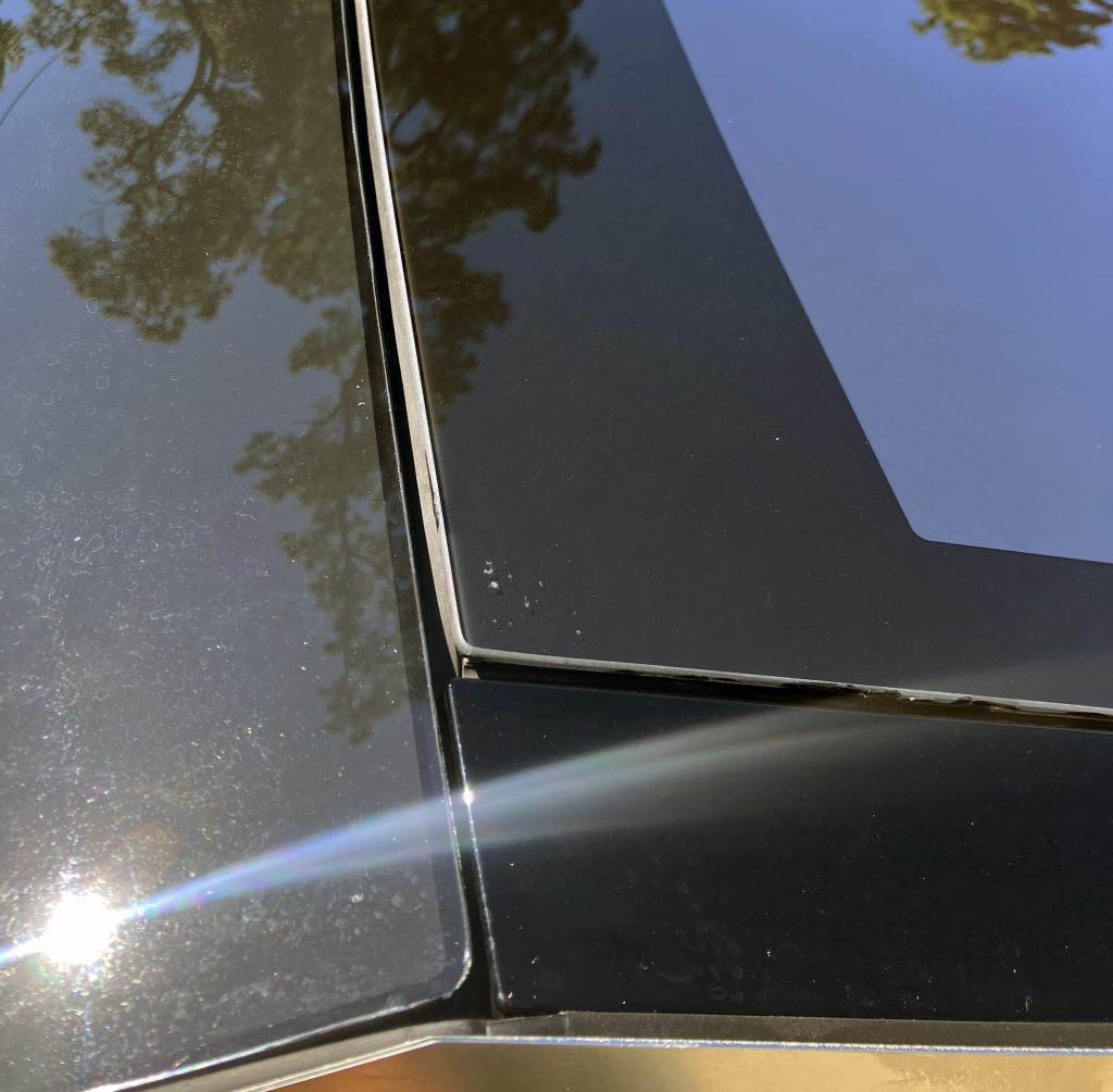
This is such a strange combination of black trim, glass, rubber, and metal (stainless steel) in an automobile. It feels more like interior design for a high-end dressing room, not an automobile.
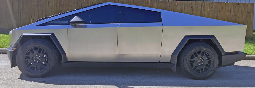
That’s just the start of automotive design intersecting with architecture and interior design. A pyramid-shaped truck with stainless-steel cladding worthy of the poured concrete aesthetic of brutalism does not make for a conventional assessment normally found here at Vellum Venom.
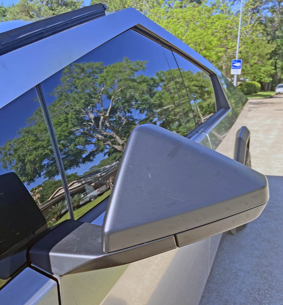
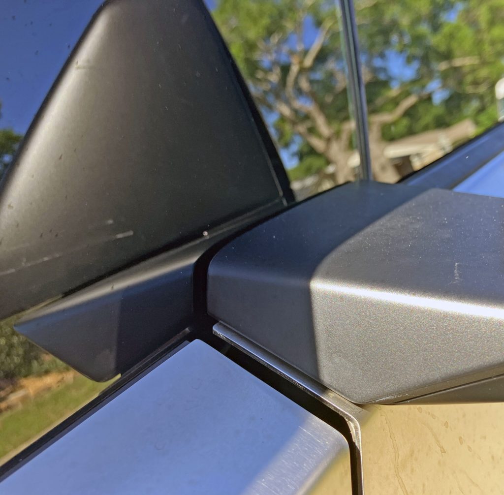
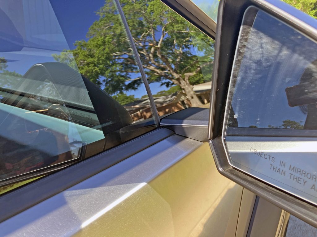
Tesla wisely stuck with a front DLO made entirely of glass, leading to a side-view mirror mounted to the door. But since this is the Cybertruck, the mirror body is also pyramid-like, with a base that varies in thickness to keep the design from looking static at any angle.
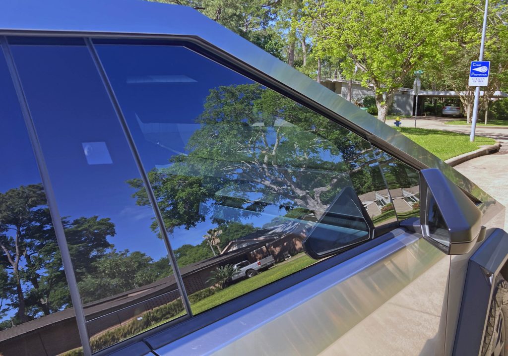
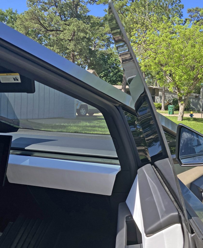
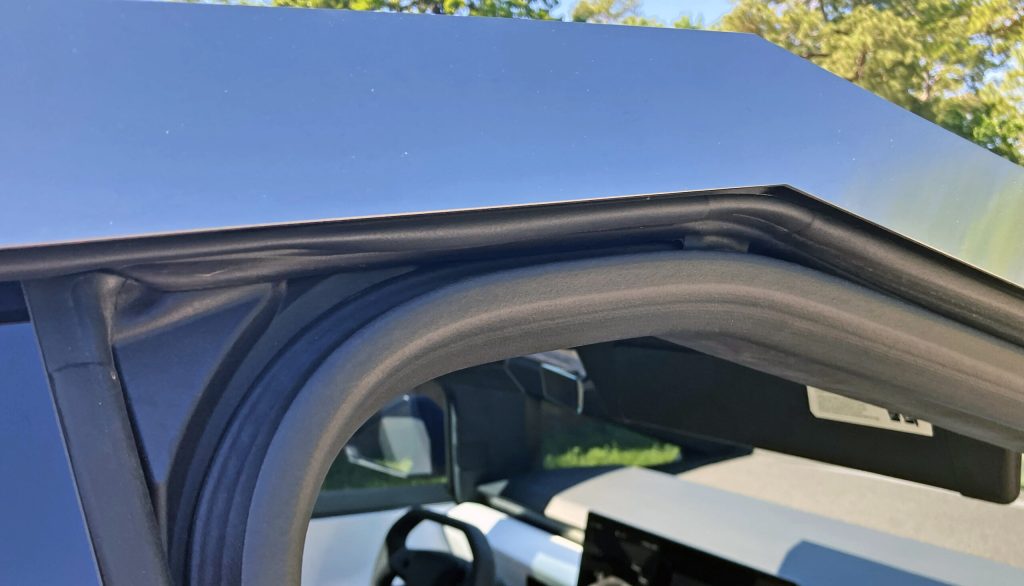
The front door glass is as terrifyingly triangular as the side-view mirror, sporting a steep rake at the A-pillar, a modest amount of tumblehome, and an awkward door aperture with a rounded weatherstrip seal. Not having any section of the roofline parallel to the ground is beyond unconventional for a truck, but this application works: Most folks will be able to enter the Cybertruck without their heads getting anywhere near this pyramid-shaped top.
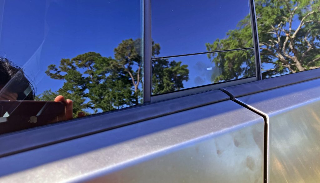

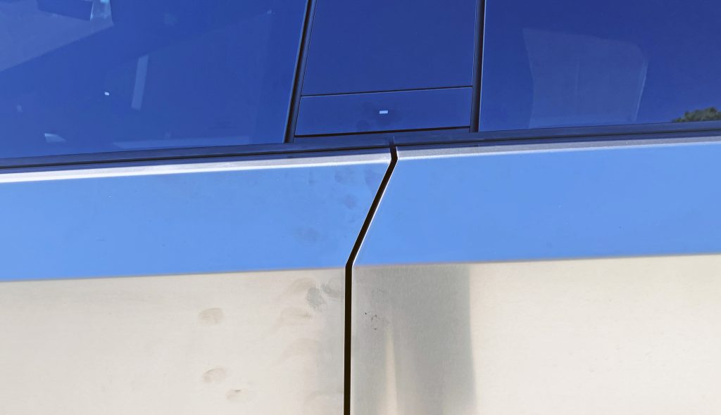
The B-pillar is remarkably conventional, as even a pyramidal roof needs an upright support. The verticality is complemented by the strong bends in the sheetmetal, complete with a door cut line that adds a forward-thrusting element to the design.
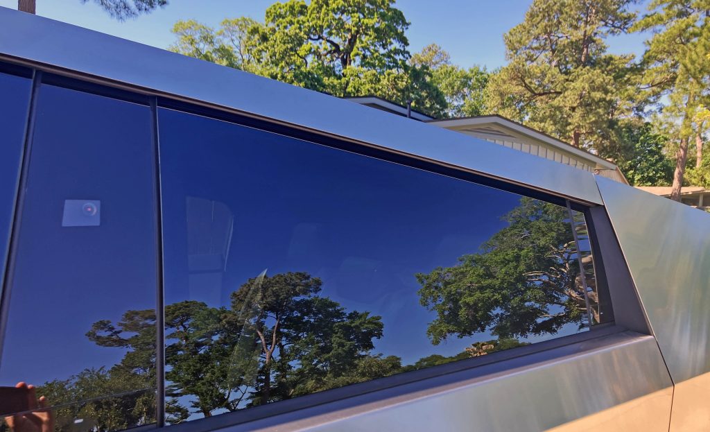
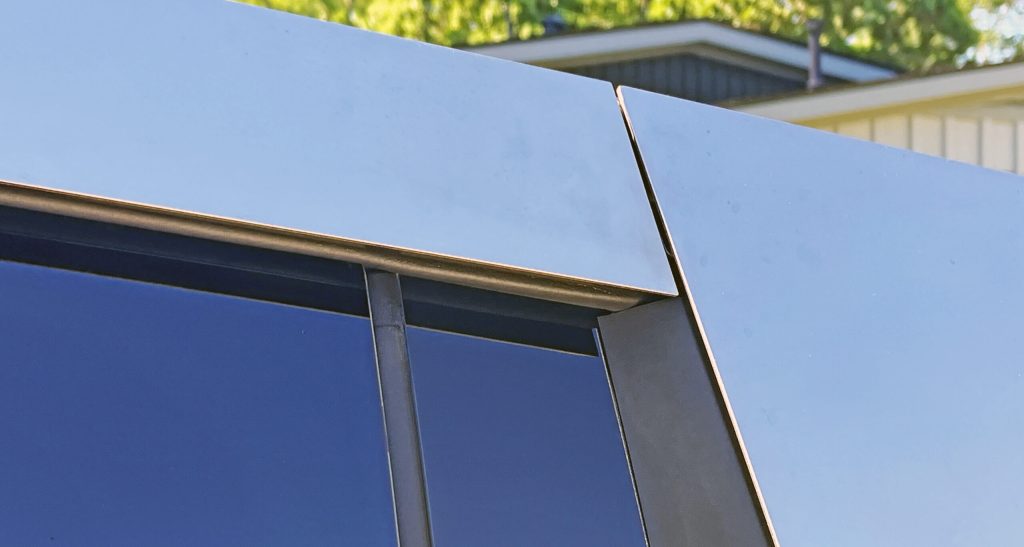
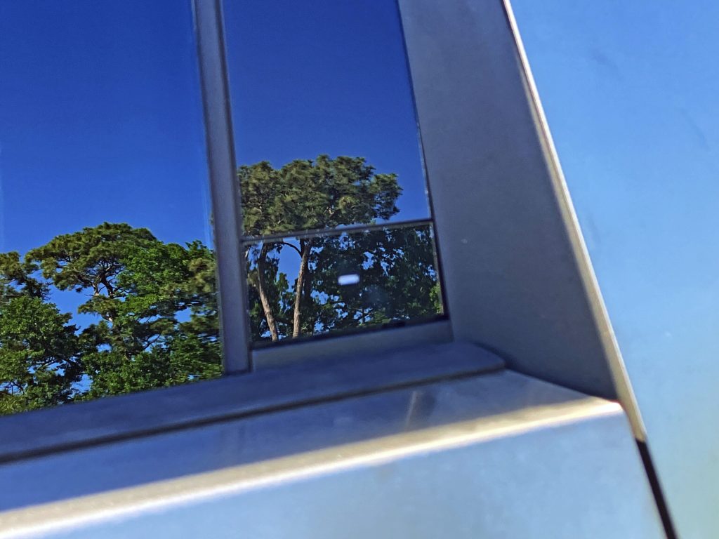
The rear door is a bit more conventional, with a radical downward slope but a more conventional-looking four-sided polygon as a sheet of glass. The shape cheats your eye at a quick glance, as the stainless steel roof cuts off at a different point than does the window’s glass. Tesla added a black plastic insert (with electronic door release) after the window glass, but for some reason this DLO FAIL makes sense as a functional door release and not just a fake vent window.

No such complications when looking south of the Cybertruck’s belt line, as there’s a single crease in the sheetmetal, with an almost conventional rocker cover underneath.
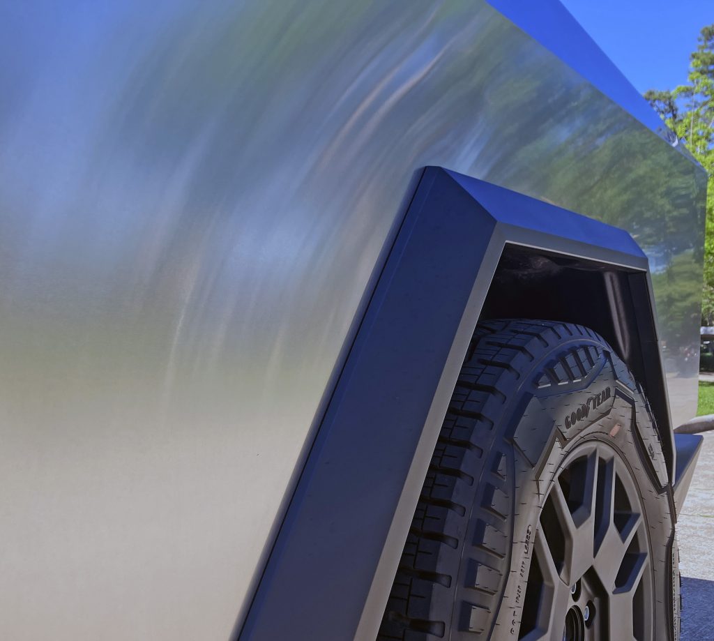
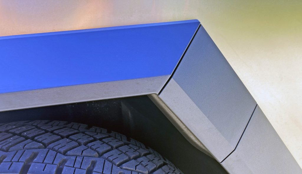
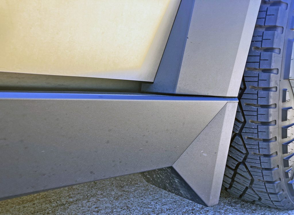
The rear wheel arches suffer from the same incongruity as the front (thanks to a lack of blocky wheel covers) but make for a great place for a battery-charging door. The angularity also allows for a logical transition to an integral flap at the base of the rocker panel.
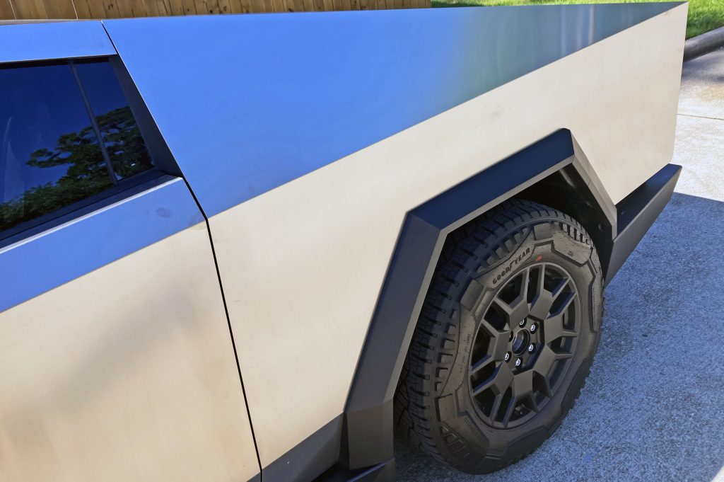
If only the wheel design was as angular as the rest of the body, as this C-pillar takes what we saw with the Chevrolet Avalanche (i.e. flying buttress) and turns it into a razor-sharp arrowhead that loves to play with sunlight and reflections.
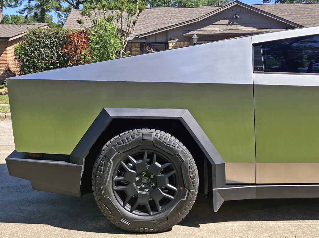
From a lower, more head-on view, the Cybertruck loses its arrowhead levels of sharpness. The tall, upright cladding becomes far more like a conventional truck.
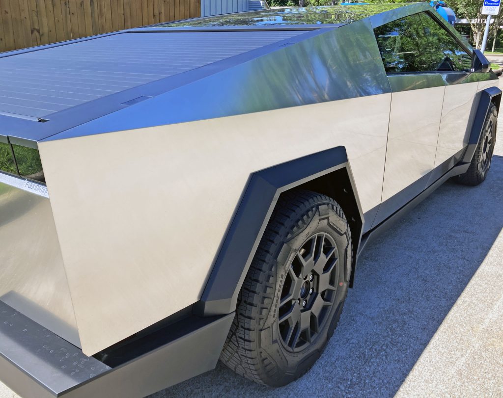
But there’s nothing conventional about this truck, as no truck has ever considered the boldness of just a few lines run across its entire body. The most obvious example is the crease that runs from the top of the front end’s light bar, to the top of the rear lighting assembly.
While the pyramidal roof has more initial bite, the Cybertruck’s flavour profile comes into full view while digesting this endlessly long crease.
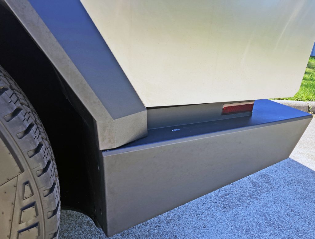
Much like the front end’s negative space reserved for headlights and turn signals, the space between the bed and the bumper is perfect for a side marker light.
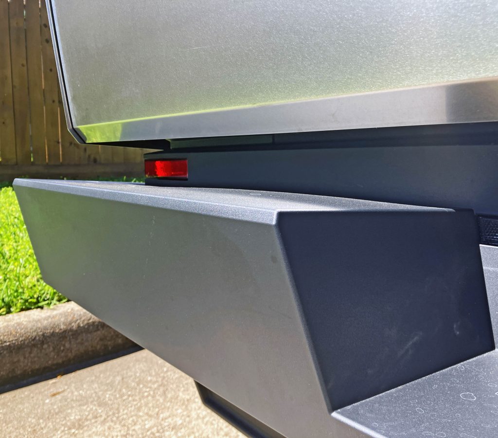
Like a large shop window facing a street, the red lense extends around the side and to the rear, where it’s greeted by a minimalist bumper that looks like a deconstructed Ranch Hand bumper.
And much like a brutalist building that faces a main street, the Cybertruck’s bed (and tailgate) sliced off the bottom right angle to reduce the visual weight above the red “shop window” in the bumper.
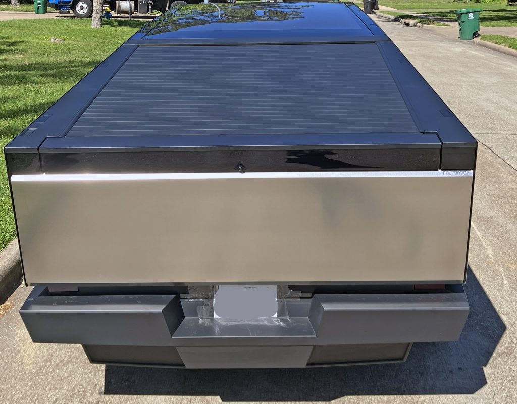
That massive array of quadrangles comprising the bumper make plenty of sense with a flat, rectangular rear tailgate that fully extends to the Cybertruck’s corners.
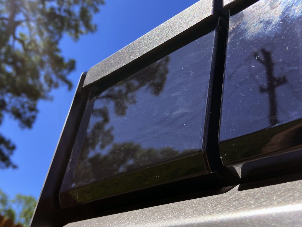
Due north of that stainless-steel tailgate is one of the Cybertruck’s more impressive design features, a smoked panel with parking and brake lights. Both it and the stainless steel have chamfers to add visual tension to an otherwise flat and boring posterior. Add in the blade wings (as seen in the front) and you have a posterior that accentuates this lighting feature.
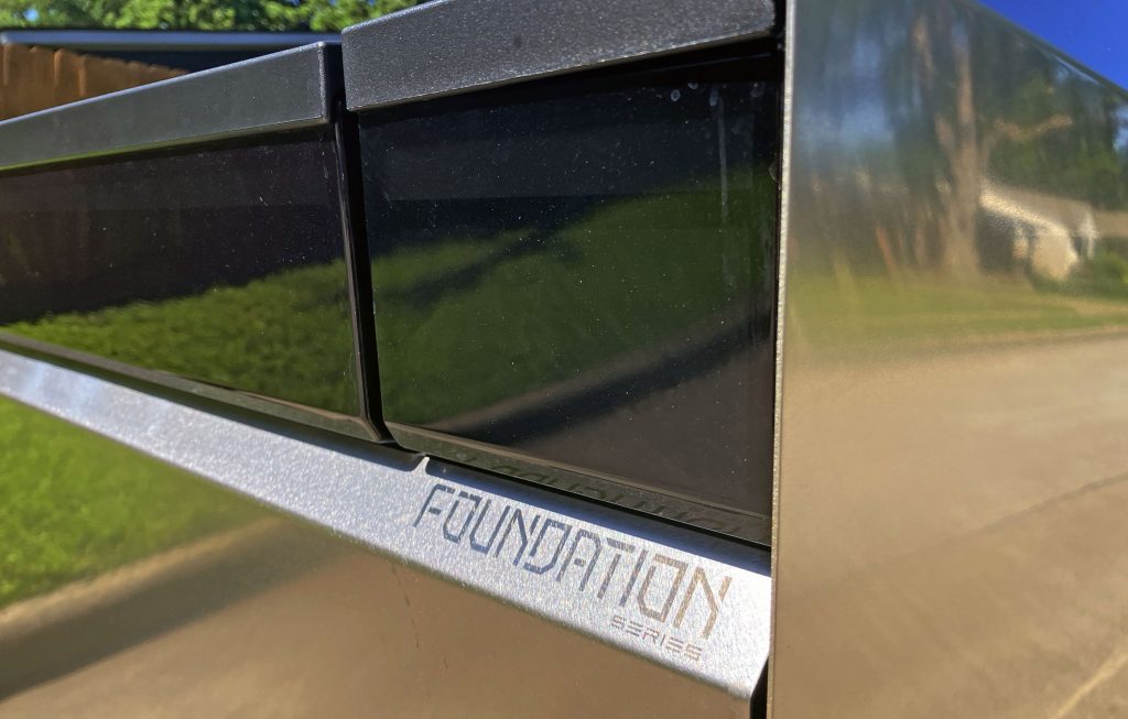
The only fly in the ointment is that the minimalism promised here isn’t present when you tap the brakes and realise very little of it illuminates. It’s best to leave the parking lights on (the whole thing illuminates) and never touch the brakes. Well, in theory.
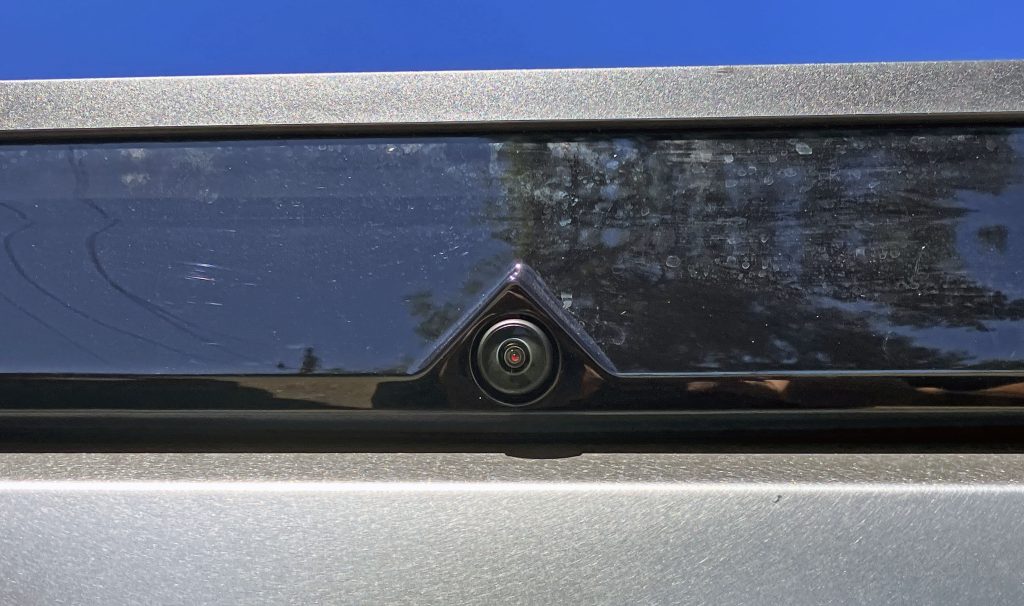
The entire panel might not be a brake light, but building a triangular footprint for the rear camera integrates well with the rest of the Cybertruck’s angular theme. The triangle’s 3-D shape also makes it easier to aim the camera correctly, without the need for amoebic tumors used on other vehicles for correct camera orientation.
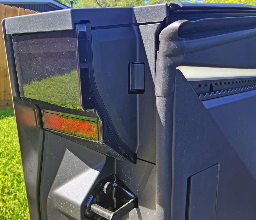
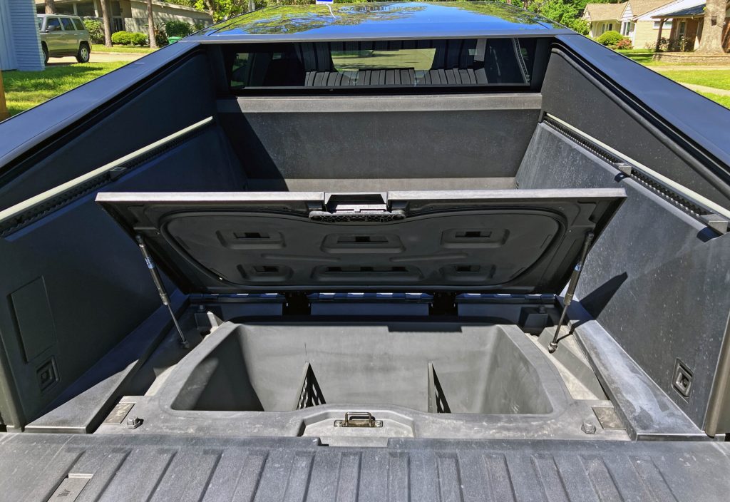
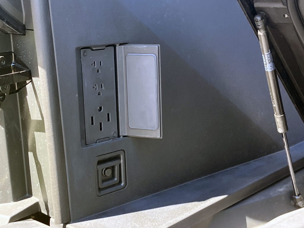
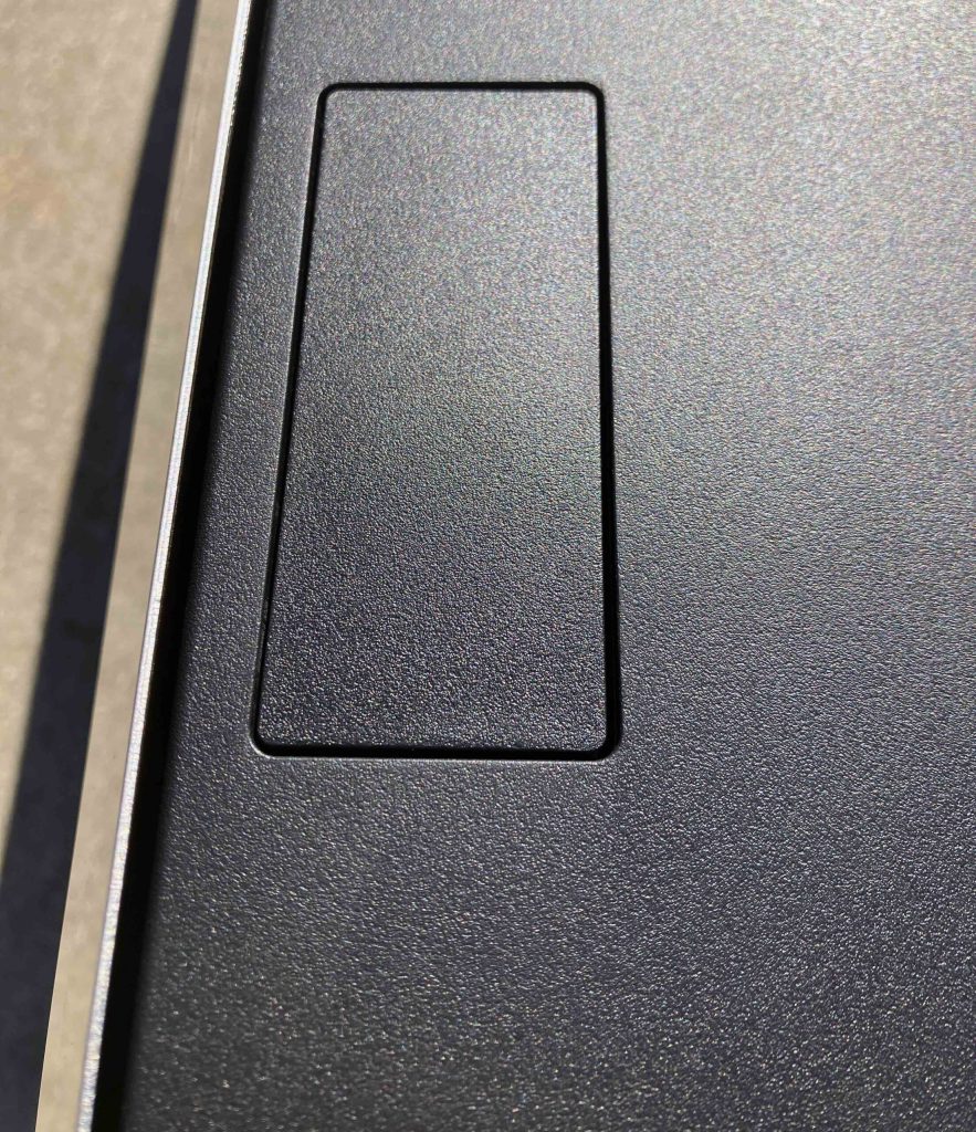
Open the Cybertruck’s bed and you’re rewarded with a redundant red reflector, a deep storage well à la Honda Ridgeline, and handy power outlets, both hidden from view until needed. The onboard power is certainly appreciated but falls functionally flat compared to the plethora of outlets available in the bed/cabin/frunk of the Ford Lightning EV. The Ford also has more ergonomic outlet covers, but ergonomics were clearly not paramount in the Cybertruck’s design. (Remember, this vehicle lacks a functional rearview mirror when the tonneau cover is unfurled.)
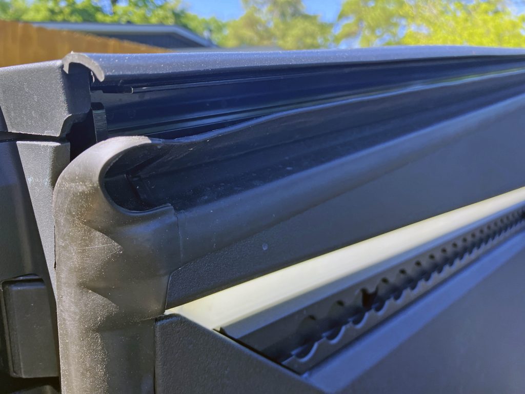

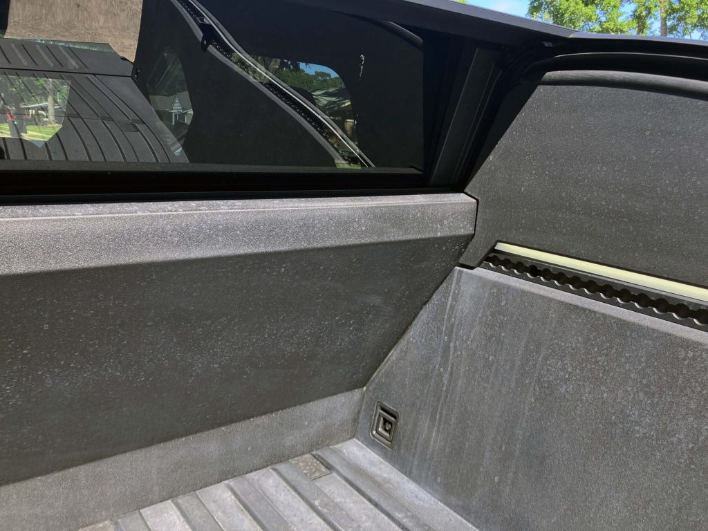
Speaking of that tonneau cover, it operates quickly and effortlessly behind all this easily stained plastic cladding. Considering how well this stuff aged on the Pontiac Aztek and aforementioned Avalanche, the Cybertruck is going to be an automotive detailer’s nightmare. This could be just as bad as the stain-creating steel chosen for the body, but it’s certainly an exciting piece of industrial design when in perfect condition.
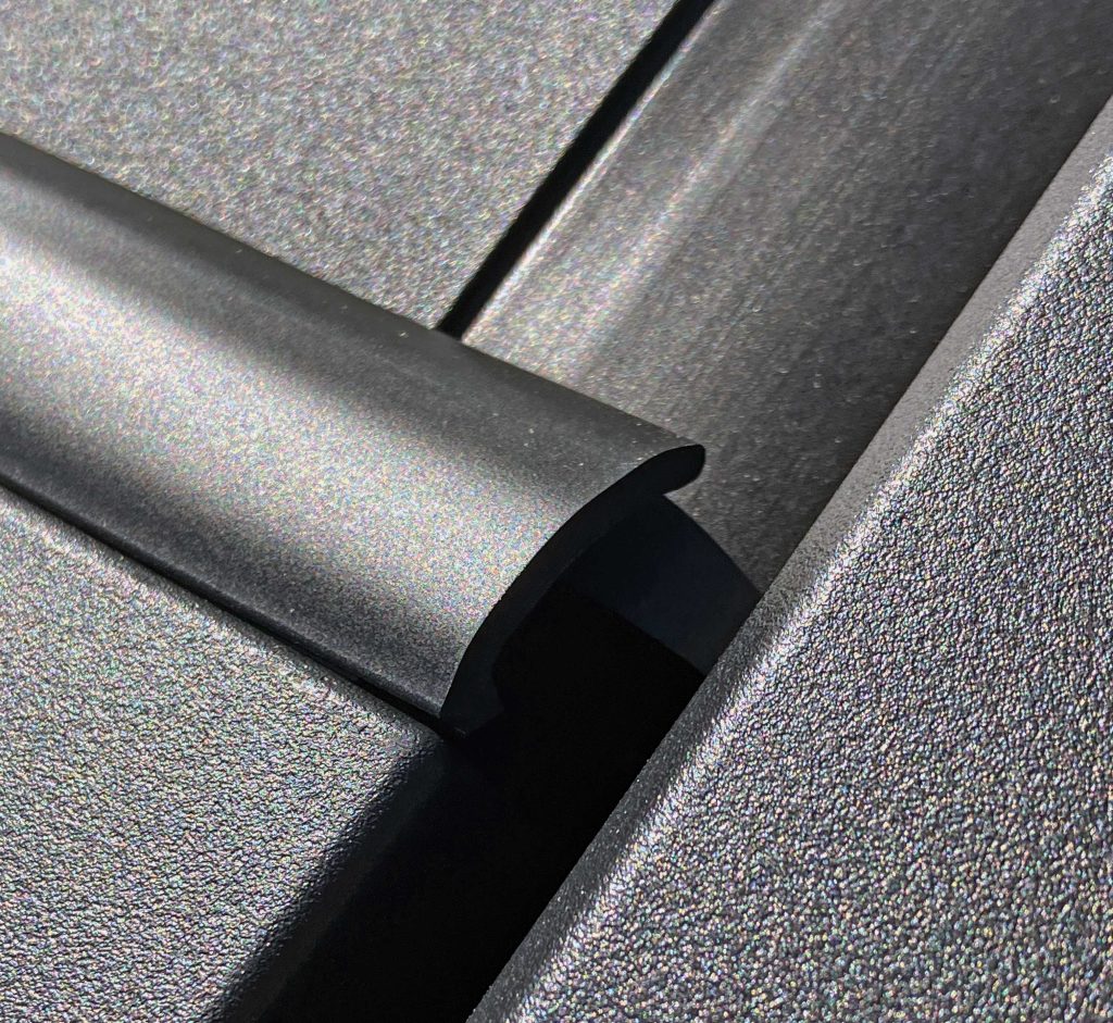
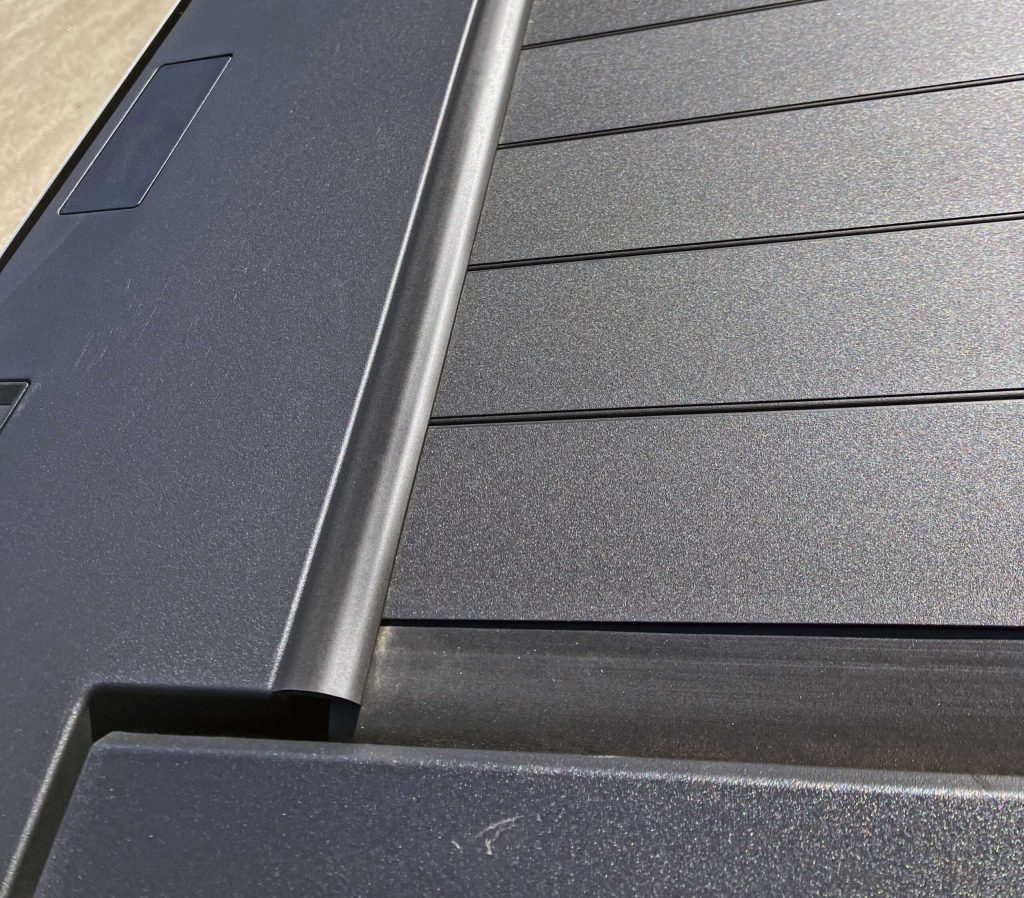
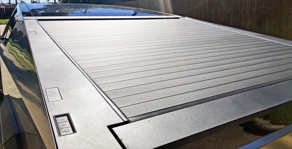
With the tonneau cover closed, the Cybertruck has an impressive contrast of plastic, glass and stainless steel, all meeting up like an edgeless infinity pool. The details (i.e. weatherstripping) aren’t necessarilty as elegant or weathertight as one would hope, but this isn’t a mass market vehicle.
Never forget, this contrived and polarising design cannot appeal to everyone like a functional/practical Ford or Chevy truck, no matter what Tesla said back in 2019.
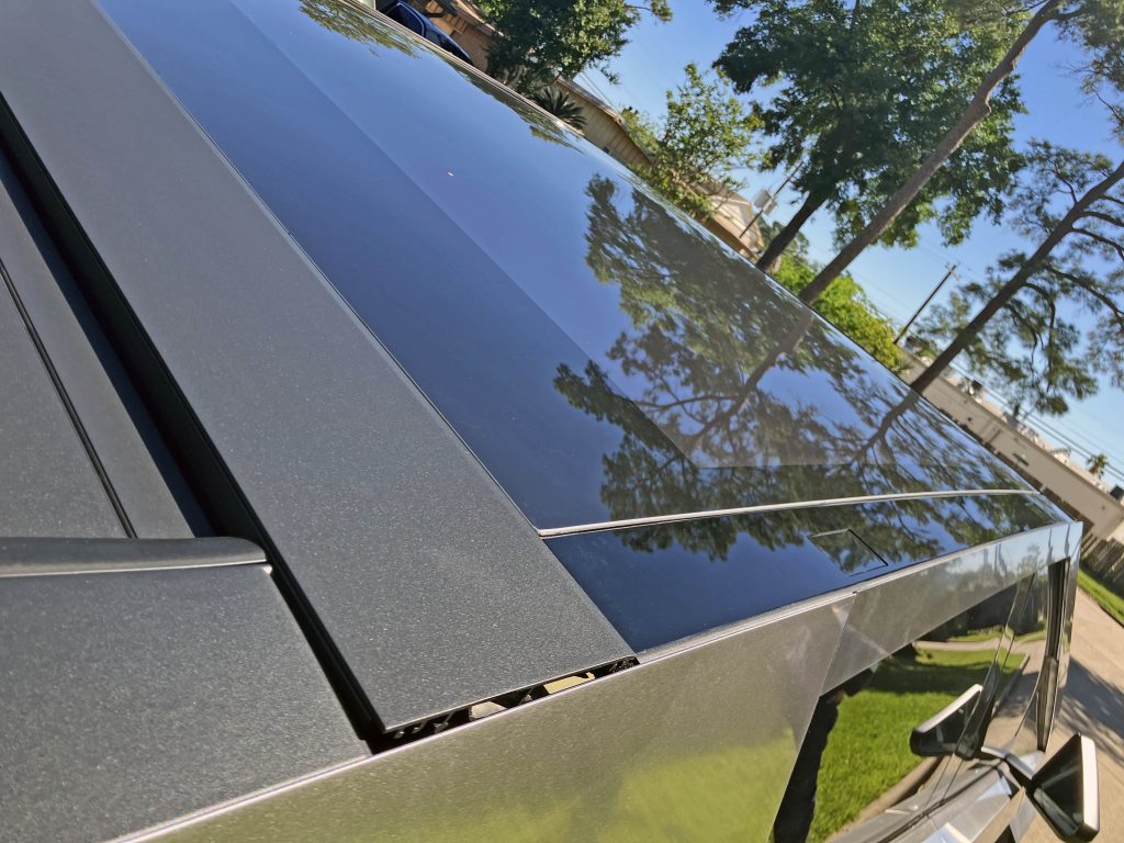
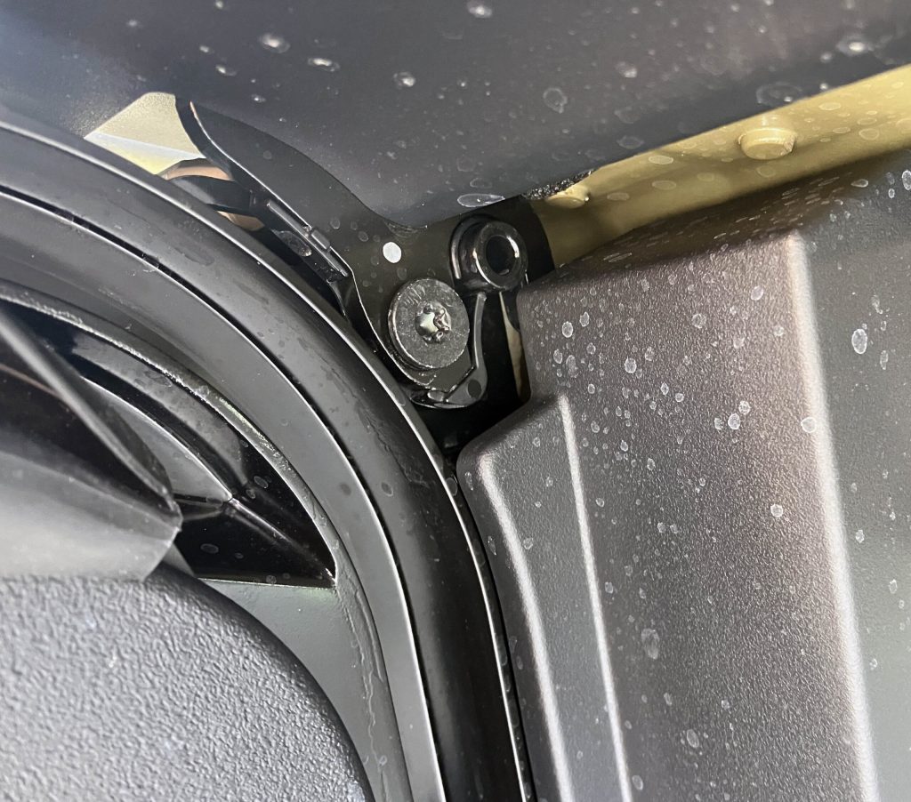
Although the build quality on this example was better than what the Internet might lead you to believe, the gaps around this panel between the tonneau cover and the glass roof clearly leave something to be desired.
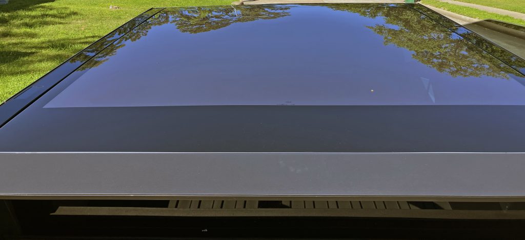
Which is truly a shame, because the transition between bed and roof is otherwise perfect. It looks expensive. It even feels expensive, because nobody else would have the nerve to make truck with a one-piece glass roof.
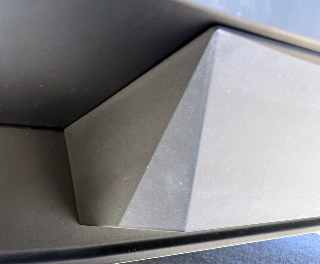
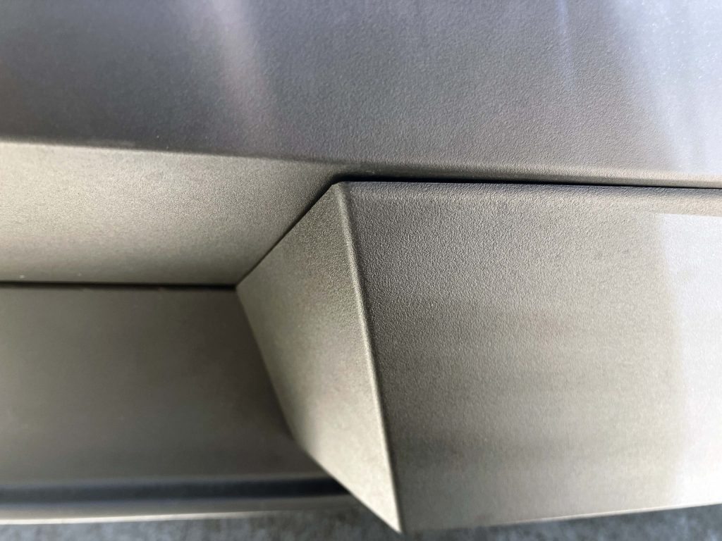
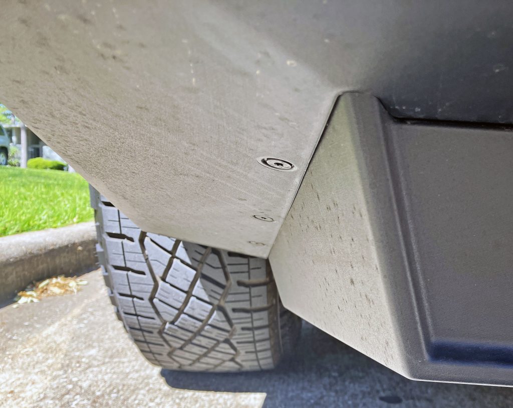
Nor would anyone else dare craft a bumper of brutalist, concrete-looking blocks arranged to both play with light and mask its functionality (centre step, receiver hitch cover) so effortlessly.
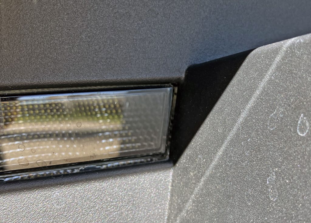
Even the backup lights are recessed deep within the rear bumper, much like many an iconic brutalist building.
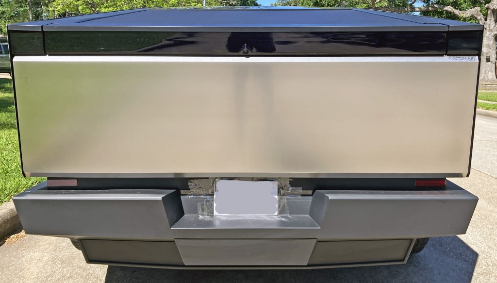
But sadly, the Cybertruck as a whole cannot delight like the individual details do when examined up close. The overall design lacks refinement, something normally resulting from months of surfacing treatments by car design teams within a manufacturer. This design was meant for quick consumption on par with a meme or shitpost, not for a loving embrace with longform content in a video or a white paper.
Nothing brings this lack of detail home like a Tesla dealership that uses packaging tape to install a paper tag. Yes really: Above, that is packaging tape on the back of a luxury vehicle that someone spent/financed $102,000 to purchase. This adds a new wrinkle to retailing concerns seen elsewhere at this company.
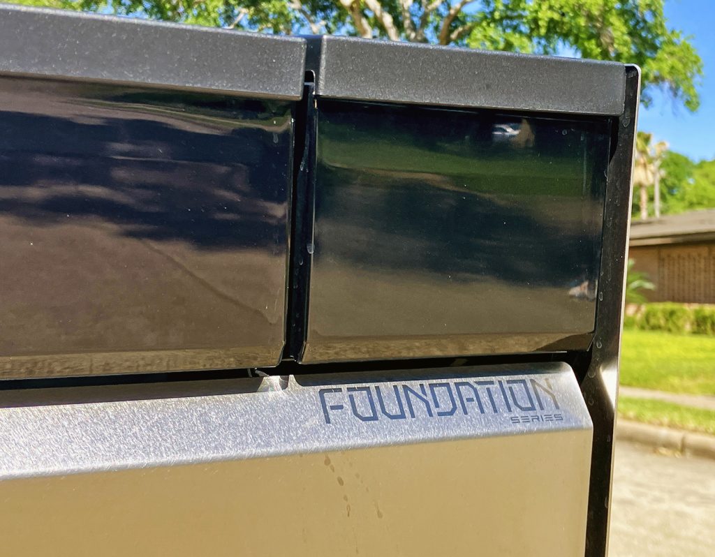
Never before have I come across a design that so delights in details, yet ultimately fails in the fundamentals. These feel like the mistakes a freshman design student will make once, and only once.
The minimalist cyberpunk theme has validity to some, though it brings about equal parts excitement and cringe to yours truly. The Tesla Cybertruck is a luxury good for a unique audience, likely a demographic that mirrors those who sided with Kazimir Malevich and his artistic suprematist followers back in the day.
But this is a product made in volume, not a controversial work of art. All vehicles (especially trucks) are primarily designed to be appealing in function and form. Even a Lamborghini Urus or Porsche Cayenne can be a soccer-mom SUV, but the Cybertruck doesn’t exist in the world of fleet managers, off-roaders, or family-oriented crew cab trucks with normal things like metal roofs and durable exterior finishes.
Instead, it feasts on the social media buzz that is so important to this company’s controversial CEO. Perhaps functionality is overrated, as its worked quite well up to this point. (Just don’t tell that to some Wall Street types.) The Cybertruck is the unobtainum minimalist wedge that was the Lamborghini Countach’s exclusive territory a few decades ago. Except it’s even more polarising, and not necessarily for the best reasons. Thank you for reading, I hope you have a lovely day.
This story first appeared on our US site as part of a regular series on design. Although the Cybertruck hasn’t reached the UK yet, the radical nature of its styling is worth looking into regardless of geography. – Ed.
